
About this project
Orient's Blog Page
A go-to source for the latest tech updates and insights.
Design Tag


Project overview
A quick brief about this project
My Role
UX/UI Designer - User Research, Design System Development, Visual Design, Prototyping
Industry
Technology Blogs
Project Estimation
2 months
Overview
This project represents a significant innovation and overhaul of an information technology blog site. The site's SEO efficiency had peaked, a complete rework was essential to drive further improvement. Our aim was to boost growth, attract new customers, and align with the ambitious objectives set by our board of directors.
What I actually did in the project
Guided by our Design Lead, Mr. Quang, I led the blog renovation. This included a full redesign of the blog UI, establishing an engaging visual direction to attract visitors, and creating a cohesive system of visually appealing thumbnails for the articles.
The Problem
The challenges aheads
Problem Statement
The company's blog has been developed over four years with significant effort and resources, successfully converted leads into customers. However, it has now reached its SEO peak, making further improvements challenging. Therefore, rebuilding the blog system is essential. Yet, there's uncertainty about maintaining current data stability, and improper execution could introduce risks.
Challenges
We have just two months to plan and execute a complete redesign of the blog page and evaluate the effectiveness of these changes. Accurately measuring metrics and proving the success of the innovation is challenging and uncertain. Therefore, we must expedite the research and implementation phases of the new design, allowing us to use the remaining time to make adjustments and optimizations to enhance effectiveness and measurable outcomes.
Research Summary
We start by researching other tech platform blogs
Our previous blog UI followed an outdated design pattern
Our website's design, crafted by our previous UX/UI designer, features a banner with white text on a deep color background - typically deep red or images with a dark color overlay. This design approach is consistently applied across all pages, including the blog page. Consequently, the blog banners and article thumbnails followed this outdated design pattern, creating a need for modernization.

Orient website hero banners
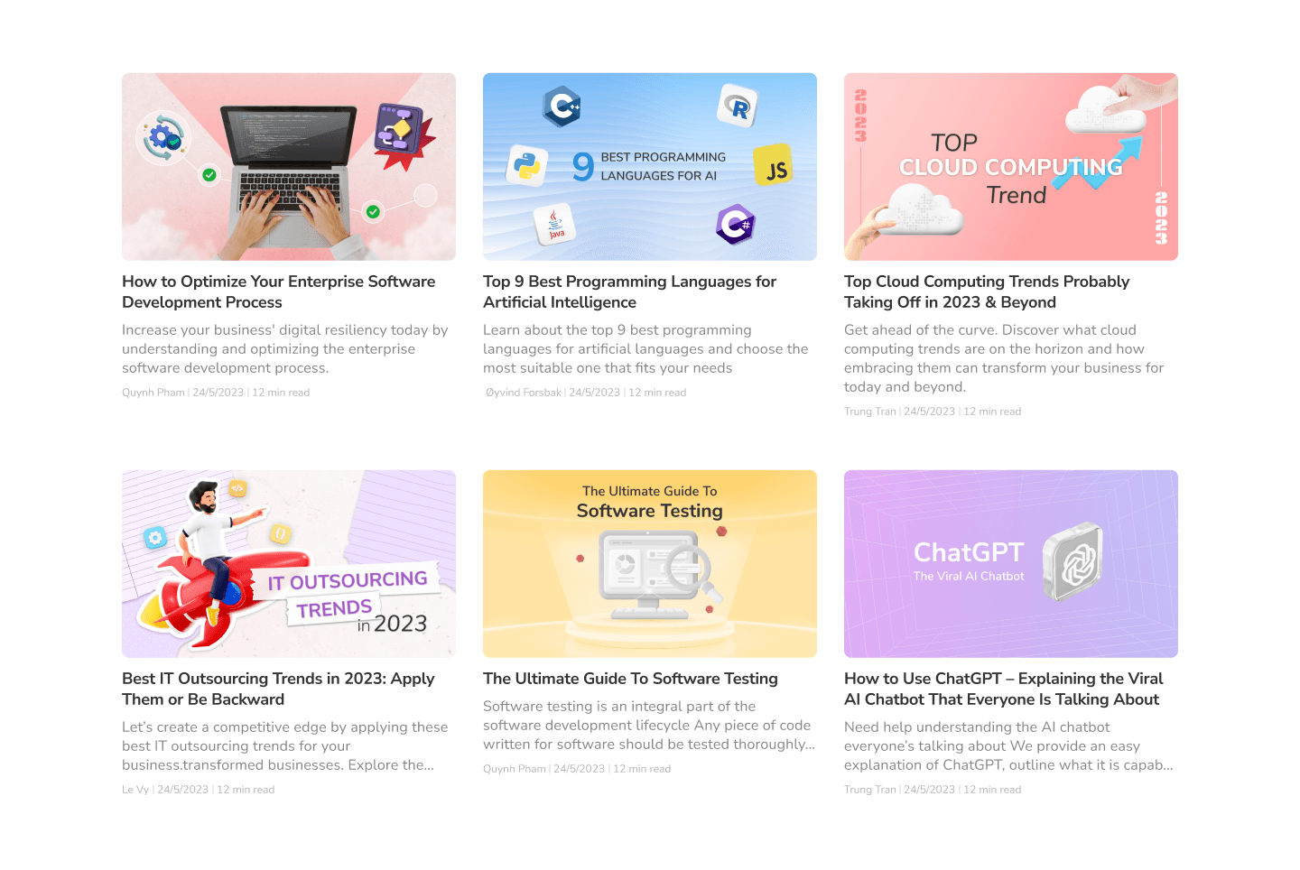
When researching a solution to address this outdated design, our initial strategy was to replace the old banners with a more modern aesthetic and redesign all article thumbnails. This involved redesigning all the article thumbnails. The task was daunting, given that we had over 200 articles, making the prospect of reworking each thumbnail a significant challenge. To address this, we began by updating the pillar blogs and high-impact articles with high ranking scores.

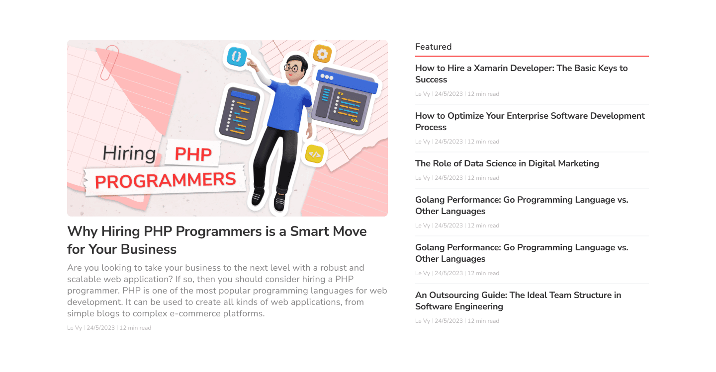
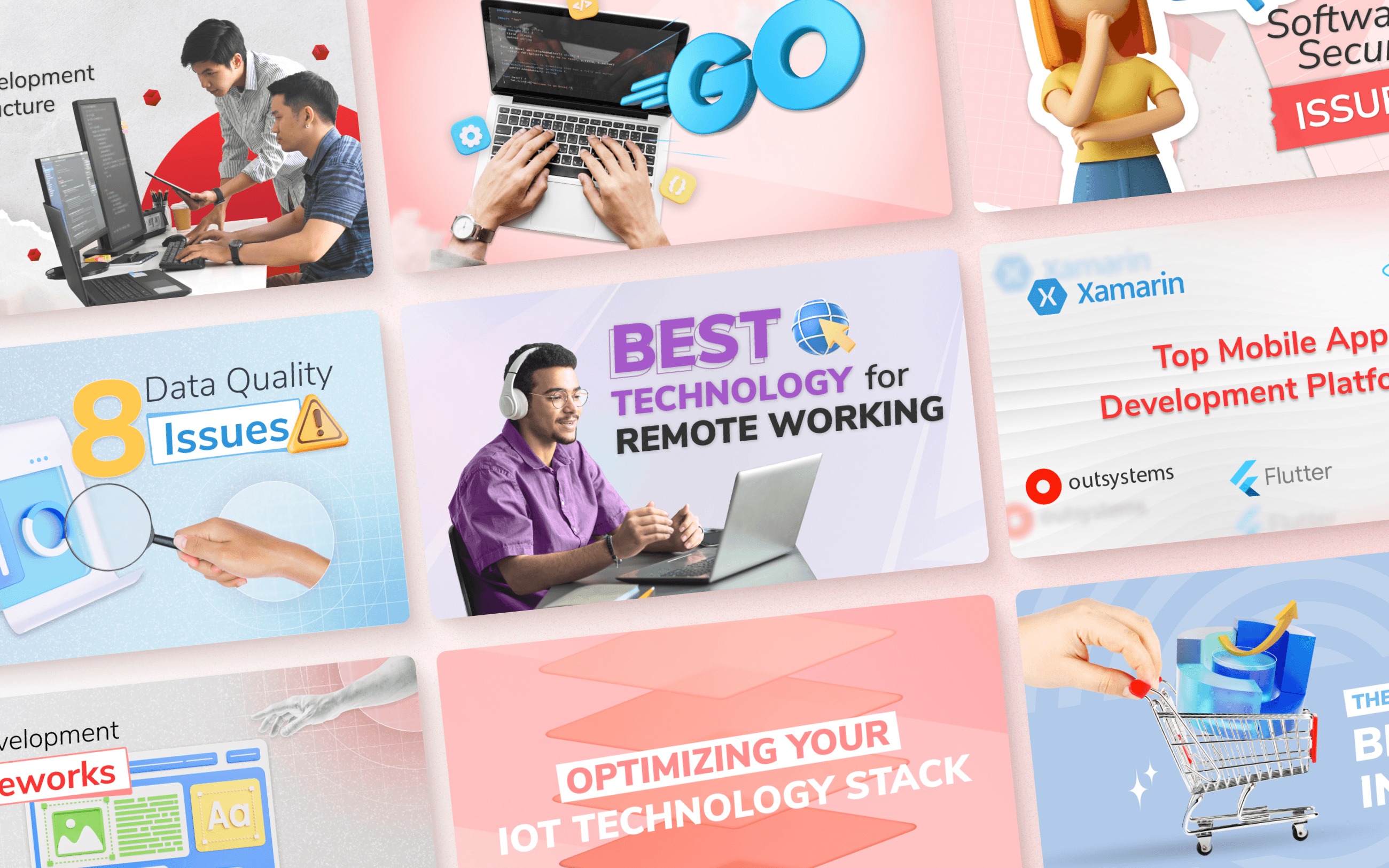
Orient Old Blog Page
For pillar blog posts, each design is tailored to the content and significance of the post. However, the current designs and images are outdated and don’t align with 2024 design trends, making them less visually appealing. Revamping these key articles is crucial because they are meticulously crafted to drive significant traffic and achieve the highest conversion rates.
Orient Old Pilar Blog Design
The tech blogs that we researched
We researched renowned tech blogs, from industry leaders like The Verge to uniquely designed sites such as The Signal and Evervault, to understand how they execute their blogs so flawlessly.

Famous Tech Blog
Marveled at how they make thumbnail images for blog posts
We admire how they've seamlessly integrated images into their blogs, creating a visually cohesive and striking experience that captivates readers like me. The way they achieve such unity and visual appeal is truly inspiring.

The Signal Blog Thumbnails
Design foundation
Revamping the blog's design foundation
Embracing the classic - responsive layout grids
We maintained the classic responsive layout for both mobile devices and desktops to ensure quick and consistent design implementation across the blog. However, the existing website's desktop layout used a 5px grid system instead of the standard 8px grid. To preserve consistency, we adhered to the 5px grid throughout the redesign.
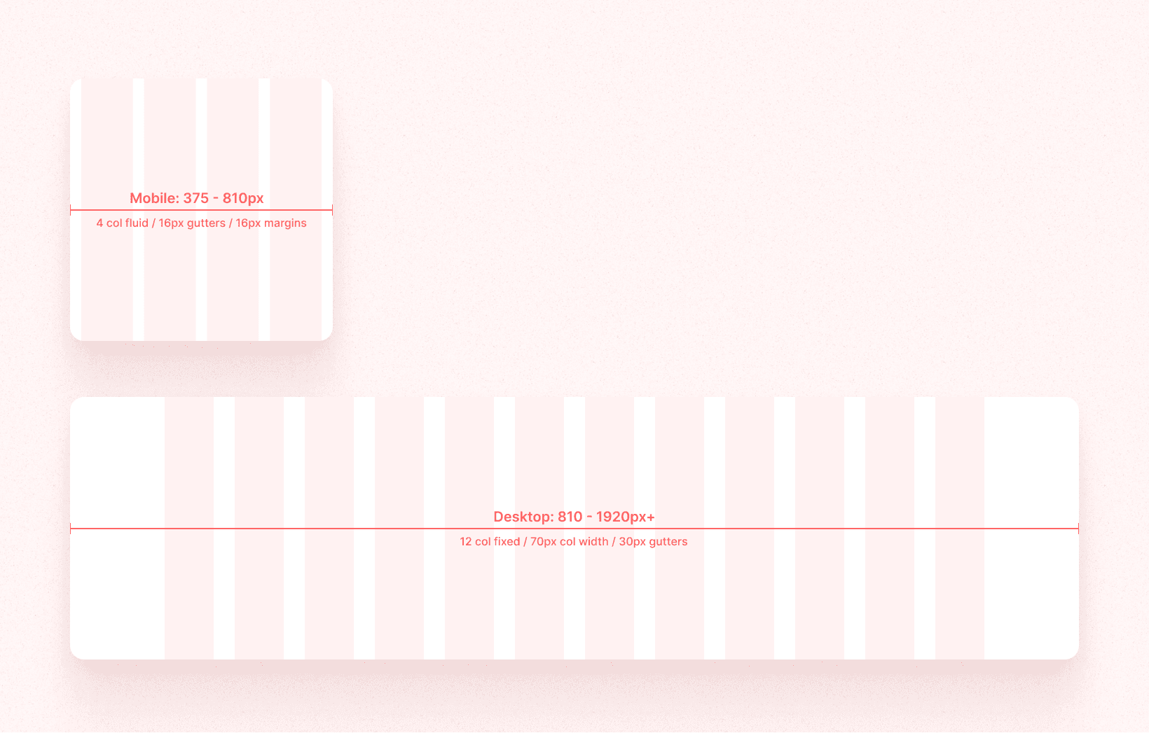
Grid System
Going for the classic blog cards layout
After researching prominent blogs, we decided to adopt popular layouts for blog items, including 6-4 ratio 2-grid, 3-grid, and 4-grid columns. These layouts are designed to be comfortable and readable for users, ensuring a neat and user-friendly design.
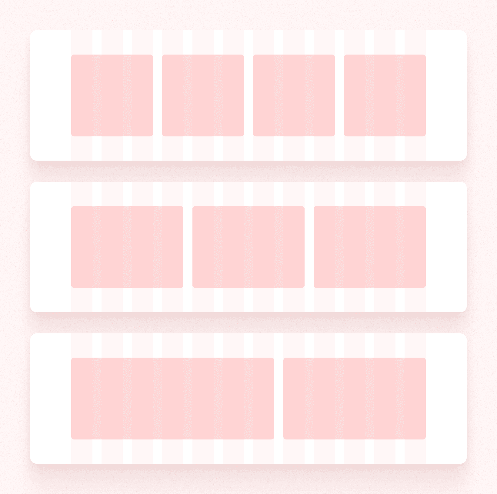
Items Layout
Blog item components
We began by designing common blog card components tailored to the layouts we had chosen.

Blog Item Components
Components assembling
After completing the design of the blog card components, we carefully integrated them into the overall layout to finalize the mockup. This step involved ensuring that each card aligned seamlessly with the intended user experience, creating a cohesive and visually appealing design.
6-4 ratio 2 columns card layout
3 columns card layout

4 columns card layout

3 columns text layout
Blog Categories
Our SEO expert meticulously categorized the entire blog into five primary sections: Outsourcing, Software Development, Quality Assurance, AI & Data Science, and Business Innovation.
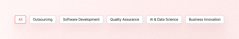
Blog categories
Since Outsourcing and Software Development are primary, we used the brand's main colors for these, while assigning distinct colors to the remaining categories to ensure diversity and an eye-catching overall blog aesthetic. Yellow for Quality Assurance, Blue for AI & Data Science, and Purple for Business Innovation. These colors guide the design across individual category pages and article thumbnails.

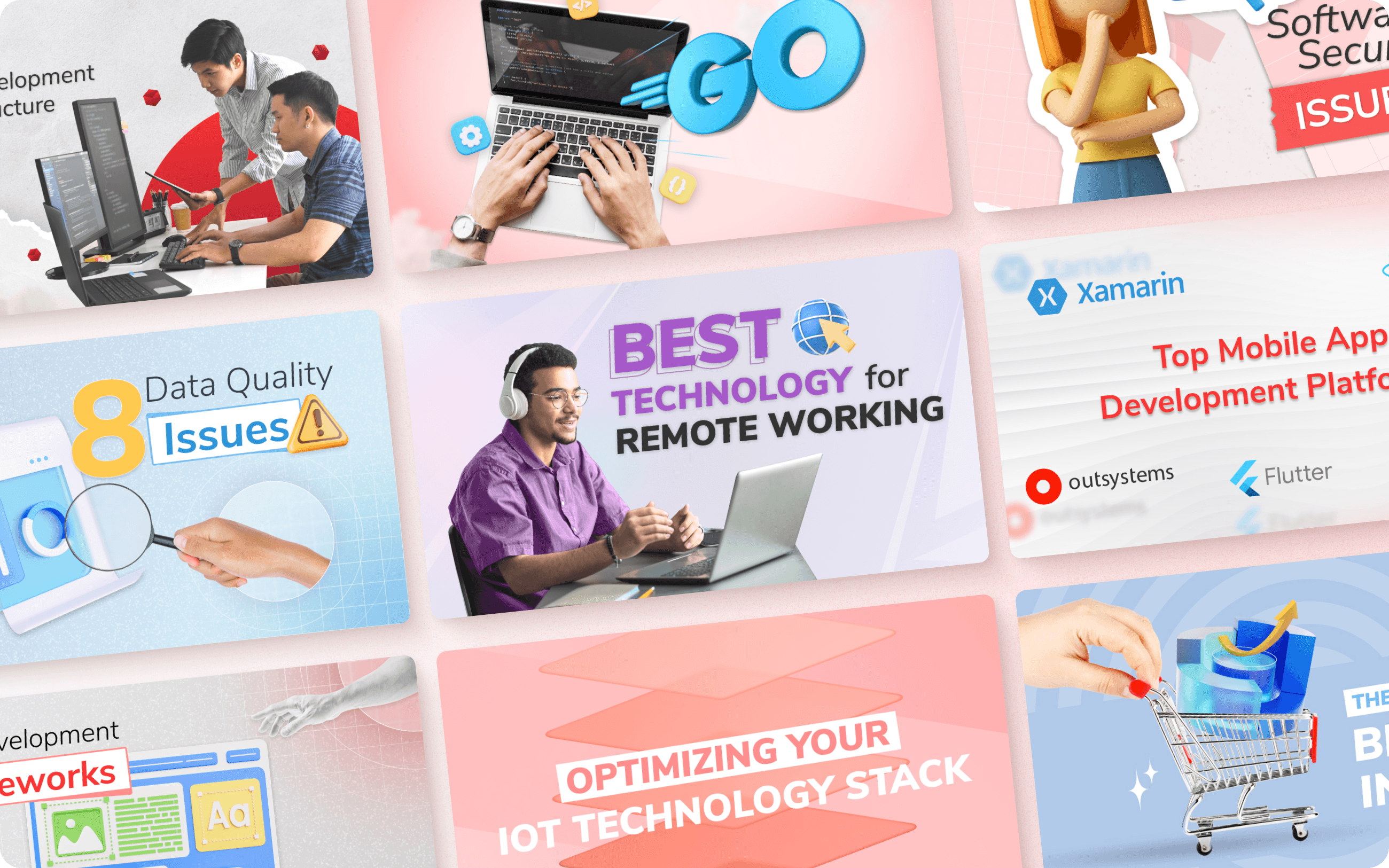
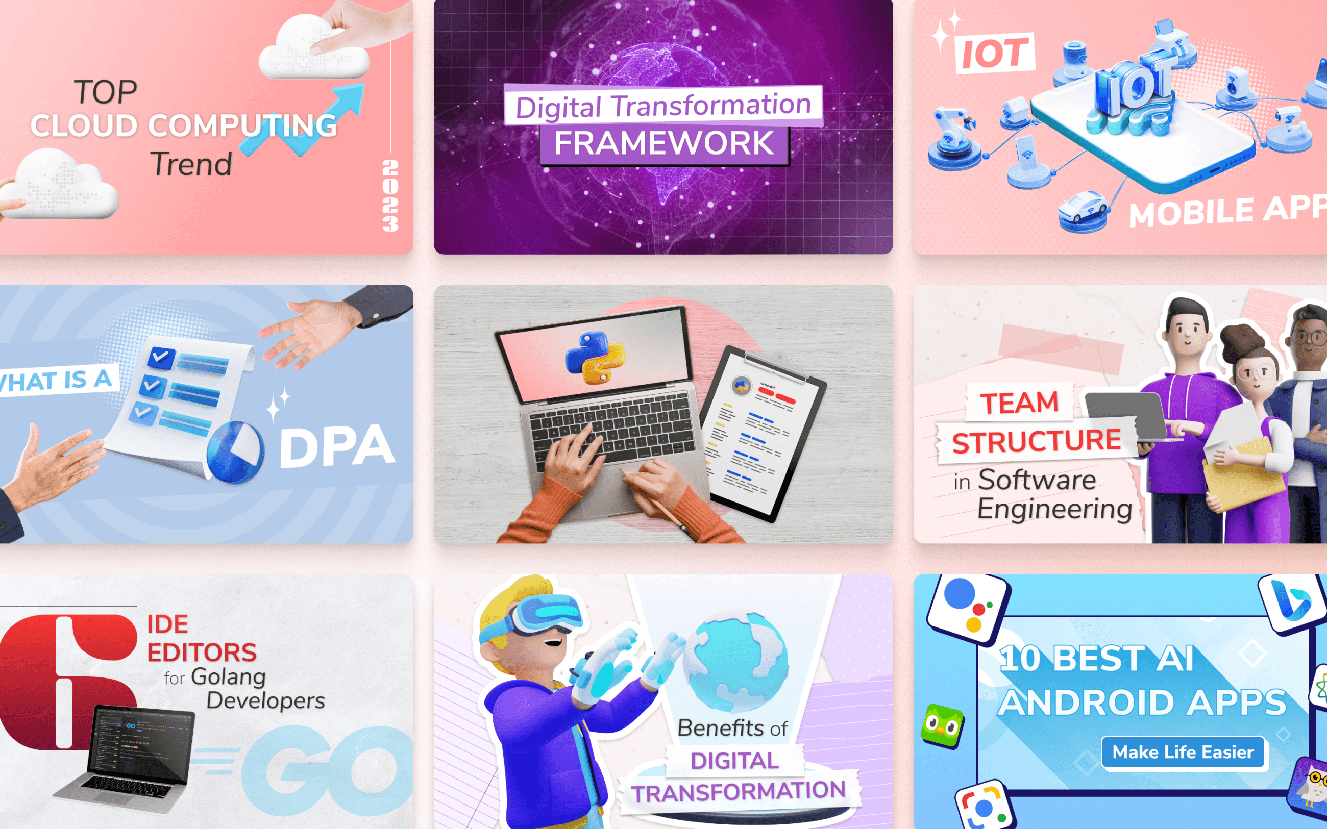
Demo blog items for each blog category
Some sample CTAs
Finally, while not mandatory, I incorporated some CTAs into the blog to direct users to our company services, aiming to boost lead-to-customer conversion rates.

Blog CTAs
Final Blog Design
The final design
Sleek and contemporary interface, ensuring effortless navigation
The final design offers a cohesive, modern appearance that follows the current design trends and maintains consistency across blog posts within each category. This upgrade not only promises comprehensive innovation but also anticipates improvements in metrics and increased conversion rates from leads to customers.
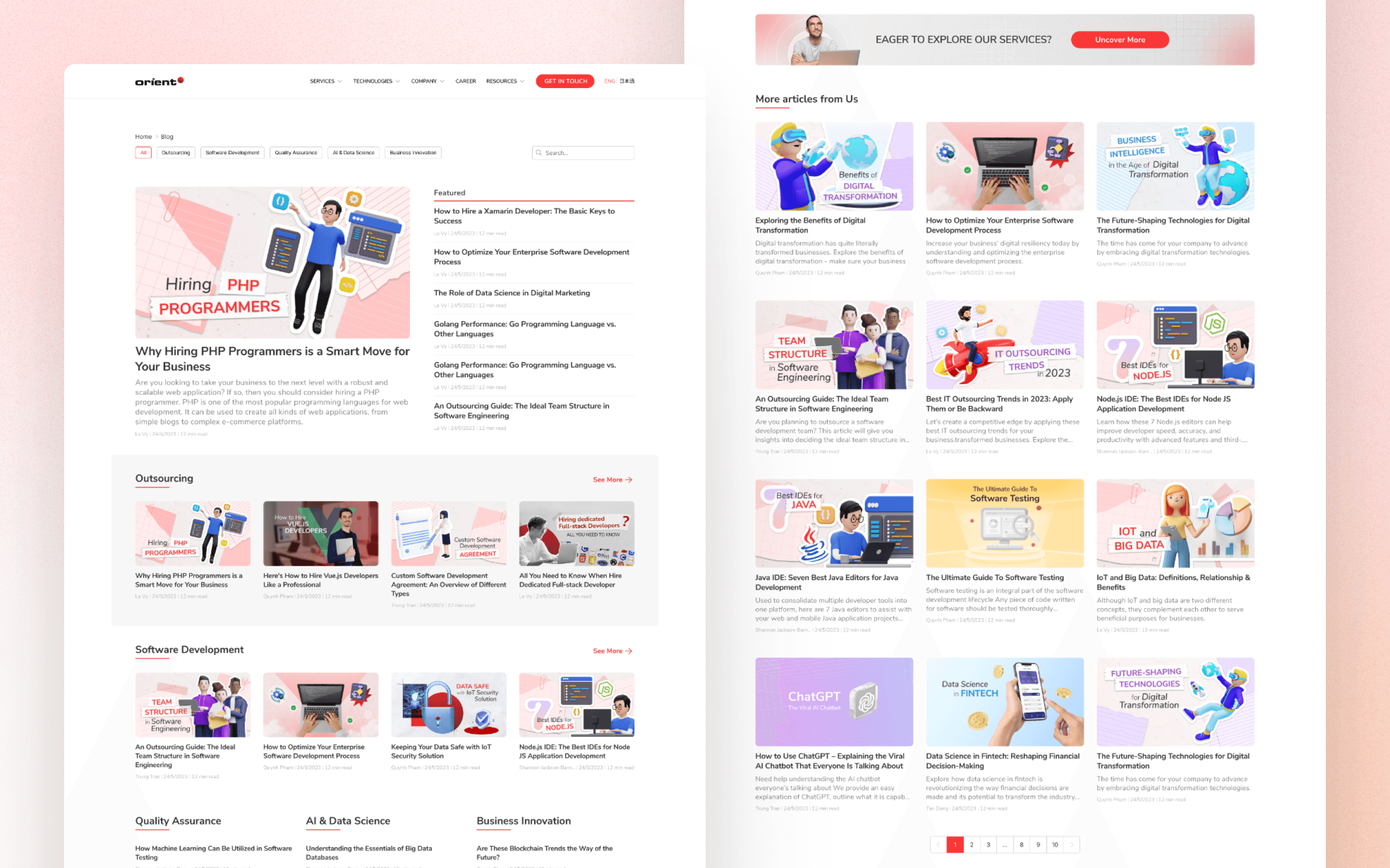
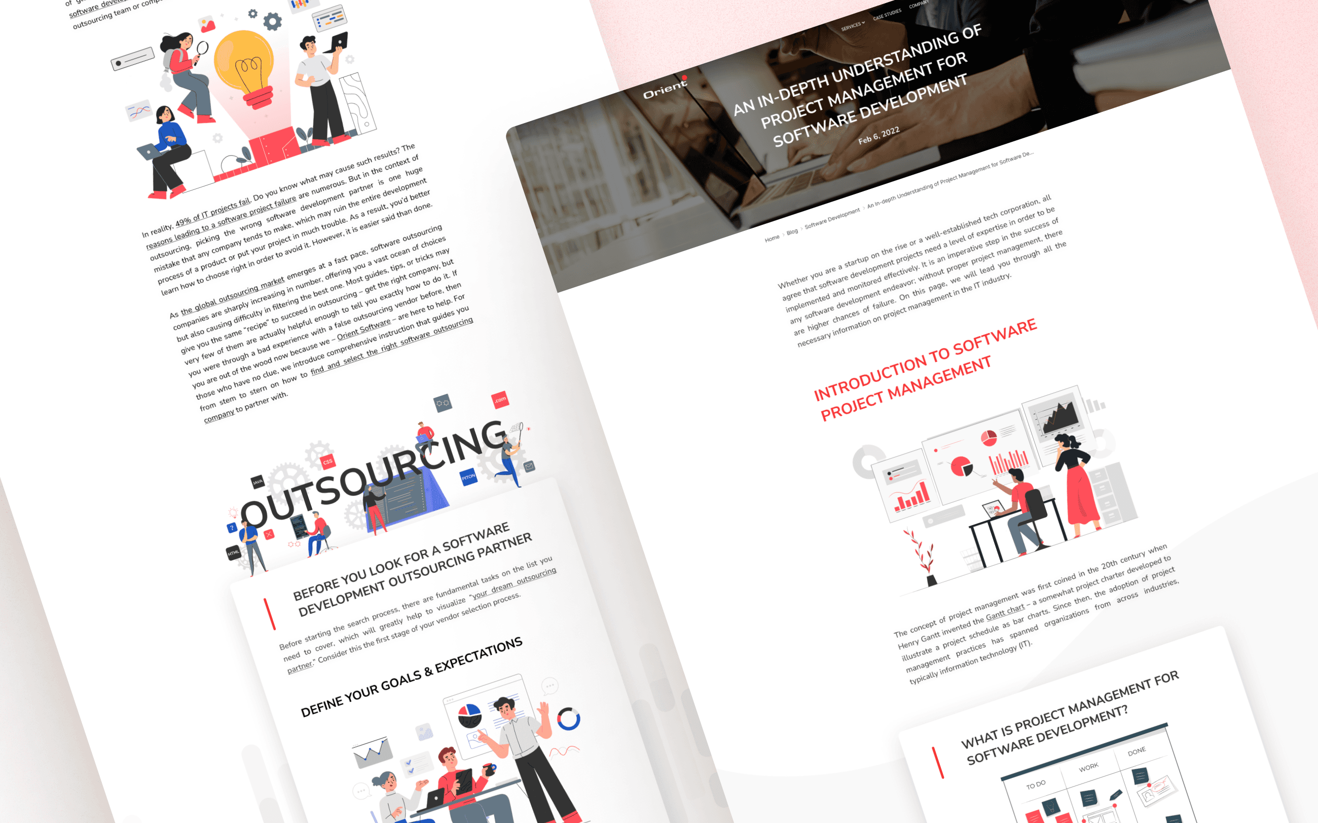
Orient Blog Page


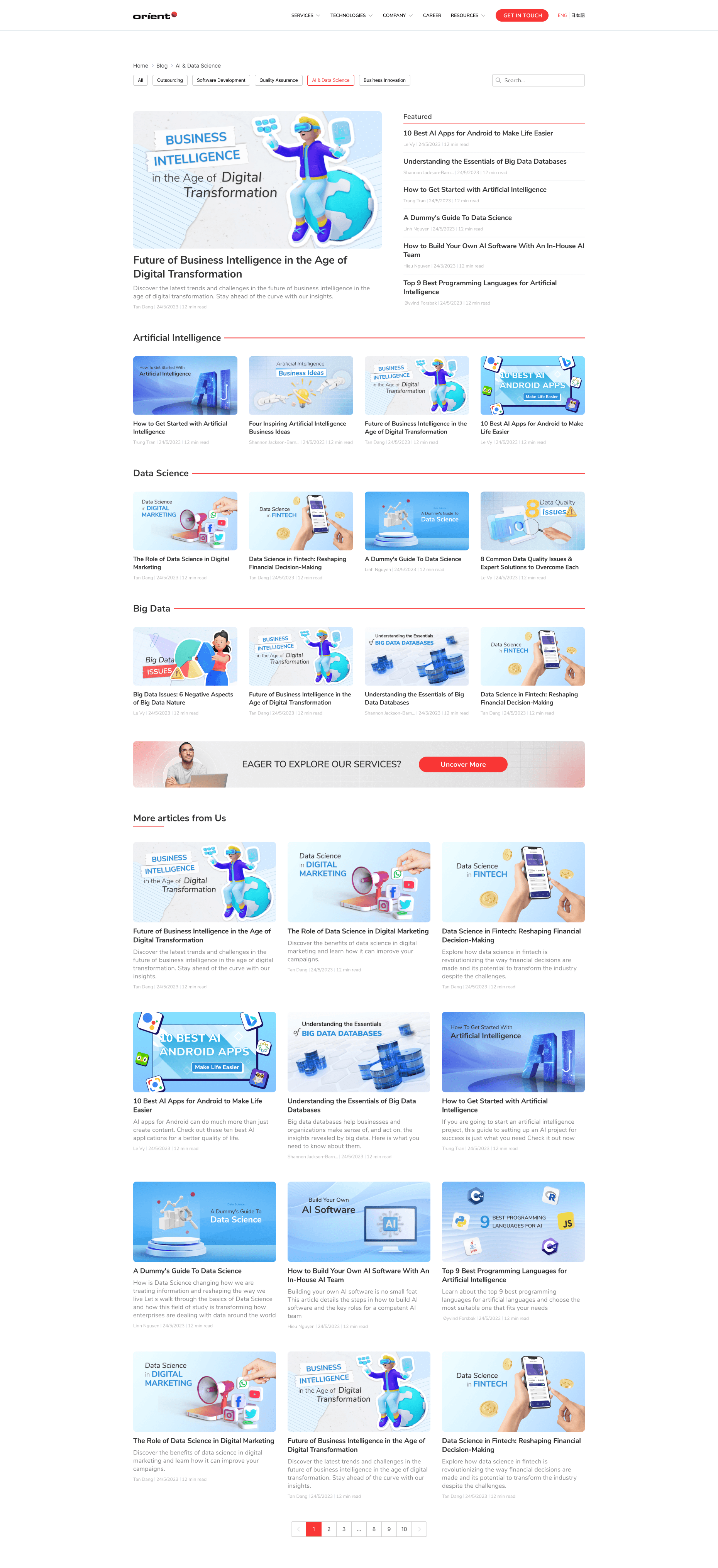
Category Pages

Blog Detail Page
A "new design standard" for the blog thumbnails
There's no rigid type or design template for thumbnail images. I prefer to vary these images periodically to enhance the overall variety and cohesion. This approach enables the design to blend multiple styles and stay current with trends.


Pilar Blog Design
Some remarkable pilar blogs design
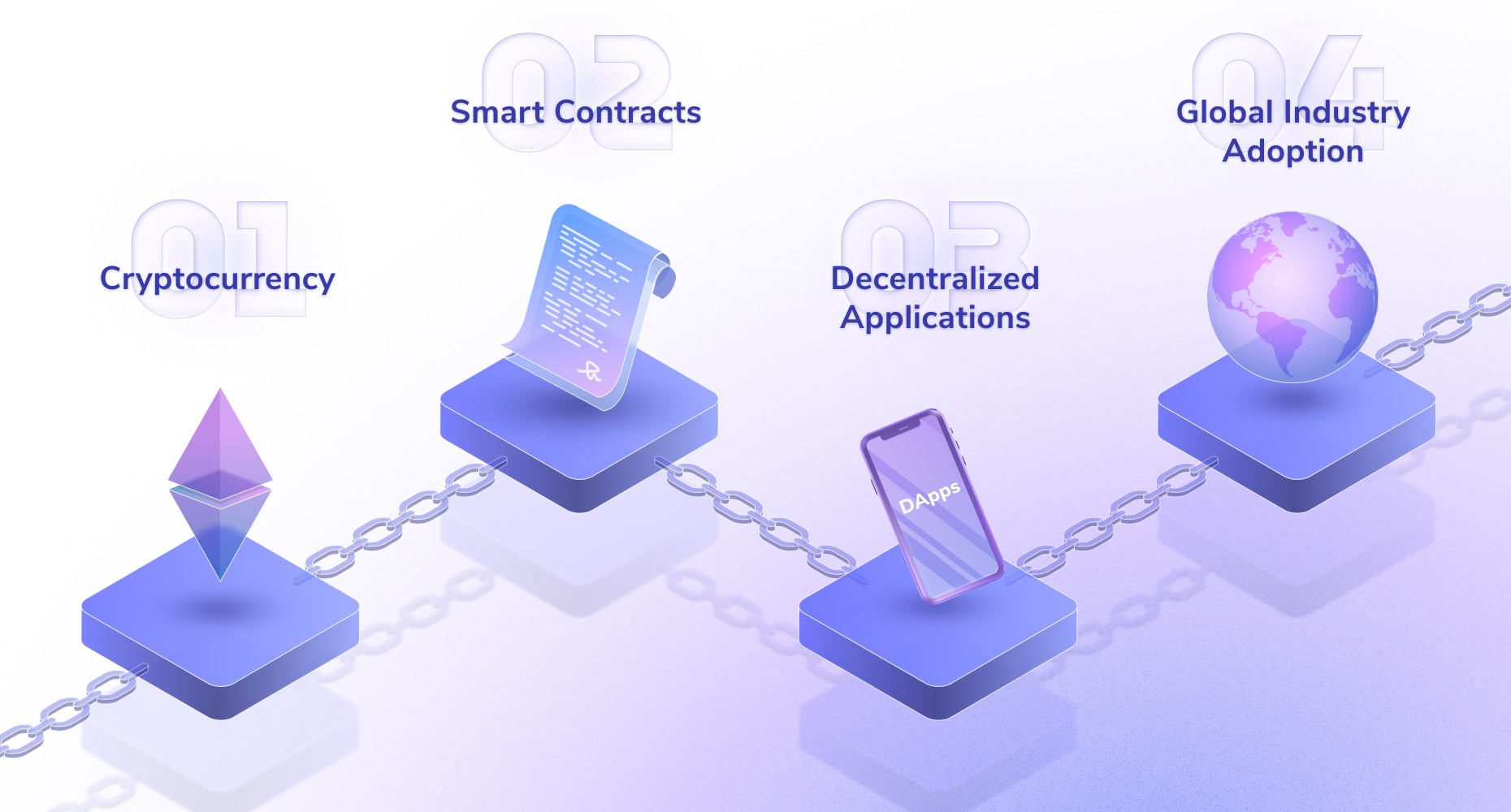
Blockchain Software Development: A Pathway to Success in the Digital Age
When brainstorming ideas for the blockchain blog, the concept of a 'block' naturally came to mind. To visualize this, I thought a blend of 3D with a touch of 2D texture would be perfect. Inspired by the popular isometric design style seen in mobile games, I decided to experiment with isometric blocks, creating an infographic that resembles a game-like aesthetic. This approach not only conveys the topic effectively but also adds an engaging and dynamic visual element to the content.
I incorporated a perspective view to enhance the blog thumbnail integration.

Pilar blog thumbnail
A modern touch
I added some noise textures and glass effects into some select design elements to enhance their visibility and draw attention, effectively complementing and clarifying the blog content.

The Blocks design

Blog Titles
Playful infographics
I utilized isometric elements to create an infographic that is not only visually engaging but also highly informative. By arranging these elements thoughtfully, I aimed to make the content both fun and accessible for readers, enhancing their overall experience and understanding.
Info graphic "Blockchain development process"

Info graphic "Step by step on developing a blockchain applications"

Info graphics responsive on mobile
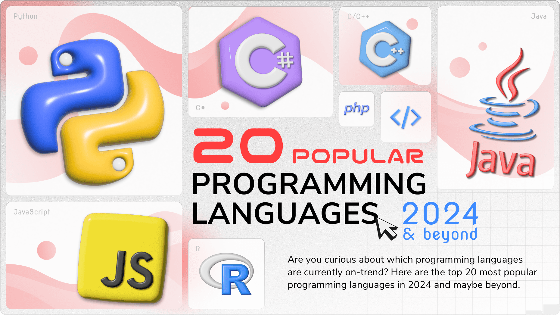
Top 20 Most Popular Programming Languages in 2024 & Beyond
When I first encountered this type of ranking article, the concepts of numbers and image sizes immediately came to mind, representing their respective rankings. To better convey the blog's content, I combined these design elements thoughtfully. By integrating clear numerical indicators and appropriately sized images, I ensured that the visual hierarchy effectively supported the article's structure, making the content more engaging and easier to understand for readers.
Fun dynamic 3D objects
My objective was to reimagine each programming language logo as a dynamic 3D object, enhancing the visual appeal of the hero banner with a playful and captivating touch. By transforming these languages into vibrant and interactive elements, I sought to create a more engaging experience for the reader, drawing them into the content with curiosity and excitement.
Pilar blog thumbnail


Blog images
Retrospective
A Success with Undeniable Outcomes
The outcomes of our design innovation far surpassed our initial projections. While direct results may not be showcased here, it's notable that this overhaul nearly 30% increase in figures from July 2023 to March 2024, approximately six months post-conversion. Moreover, lead conversions to customers showed significant progress, with a notable success rate as evidenced by our substantial lead generation and conversion of over 10 leads into customers.
To substantiate this success, numerous customer projects that we've undertaken are prominently featured in my portfolio.