Case study / UX Research / UI Enhancement


Shrimpl is an platform with the mission to make shrimp farming smarter and more sustainable. It helps farmers turn complex data into clear, actionable insights to improve productivity and reduce risk.
Overview
This redesign focuses on improving Shrimpl’s desktop dashboard experience for small-scale shrimp farmers with limited digital literacy. The goal is to simplify information, highlight what matters most, and guide users toward confident, informed actions without needing to interpret complex data.
What I actually did in the project
In this project, I audited the current dashboard, defined a key user persona, and mapped out their journey to uncover pain points. I then reframed the design problem with a focused HMW statement and proposed a clearer, more accessible layout. My redesign includes improved hierarchy, simplified visuals, and supportive UX writing to help low-tech farmers make confident decisions.
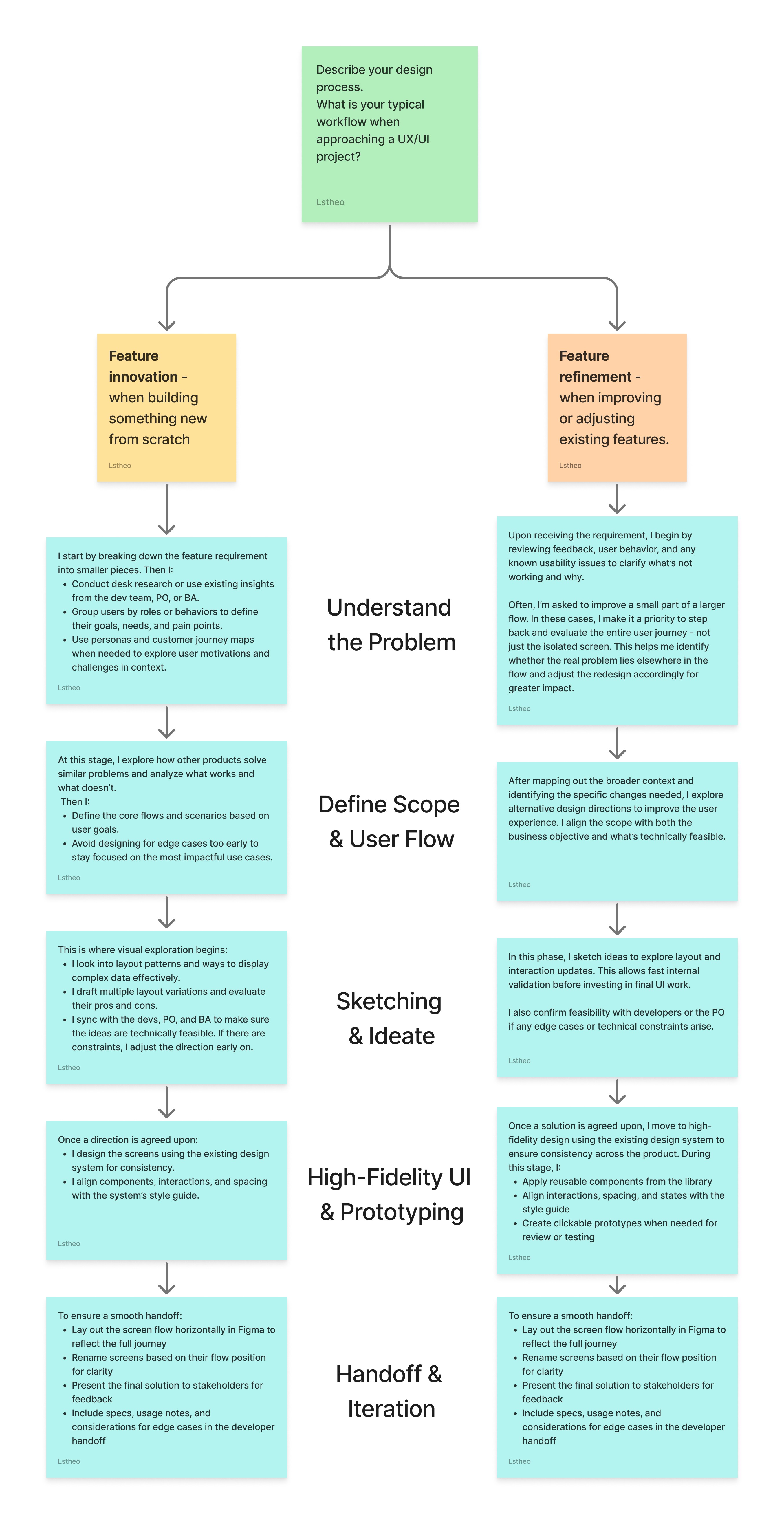
My Design Process (As for required in the assignment)
This is the same approach I normally use in my day-to-day product work. I break my design process into two flows: one for feature innovation and one for feature refinement - depending on whether I’m designing something new or improving what already exists.
Feature Innovation Flow (when creating something new):
Understand the Problem
I start by understanding the product vision, user needs, and business context through stakeholder input, user feedback, and analytics. I also clarify technical constraints with developers early on.Define Scope & Flow
I map out key user scenarios and define the core user flow to avoid designing too much for edge cases up front.Sketch & Ideate
I explore ideas in low fidelity, share early concepts with the team, and iterate quickly before committing to a direction.High-Fidelity UI & Prototyping
Once the direction is clear, I move into detailed UI using the design system. I ensure the layout is accessible, scalable, and easy to hand off to developers.Handoff & Iteration
I document flows, rename screens clearly in Figma, and stay involved during development for any follow-up needs or quick fixes.
Feature Refinement Flow (when improving existing features)
Understand the Problem
After receiving a request or spotting an issue, I review user feedback, usage data, and existing flows to understand the root cause - not just the surface-level fix. I often get requests to fix small flows, but I make sure to zoom out and see how that flow fits into the full journey. Sometimes the problem lies outside the immediate scope.Define Scope & Flow
Based on what needs improvement, I suggest alternative solutions and align with the team on the best direction.Sketch & Ideate
In this phase, I sketch ideas to explore layout and interaction updates. This allows fast internal validation before investing in final UI work. I also confirm feasibility with developers or the PO if any edge cases or technical constraints arise.High-Fidelity UI
I redesign using the existing design system for consistency and ensure layout improvements follow visual and UX best practices.Handoff & Iteration
I prepare the updated screens clearly in Figma, present the new solution to stakeholders, and collaborate closely with developers to ensure smooth implementation.
My design process link
Timeline & Checklist
Since my approach in this case study closely mirrors how I work in real product design, I’ve outlined the actual timeline and checklist of what I did throughout the project.
Day 1 (23/6):
Draft my design process section
Study the dashboard images and highlight key UX/UI issues
Send out question list for additional information
Day 2 (24/6):
Research assignment problem through business objective
Write the dashboard critique section
Sketch low-fidelity improvement ideas
Design high-fidelity UI (If possible)
Day 3 (25/6):
Polish writing
Final check on grammar, tone, and structure
Export as PDF or prepare email draft to send
Designing for Confidence, Not Just Clarity
While reducing clutter and visual complexity was important, the deeper challenge was emotional: designing an experience that builds trust and decision-making confidence for farmers with little or no digital experience. It meant going beyond clean UI - focusing on guidance, language, and subtle cues that make users feel supported rather than overwhelmed.
Business Objective
As Shrimpl expands its reach from enterprise clients to smaller, less tech-savvy farmers, the dashboard must evolve from a complex data tool into a user-friendly, decision-support platform. The challenge lies in creating an interface that is simple enough for first-time users, scalable across different farm sizes, and adaptable to cultural and technical differences from LATAM to Asia - while still meeting the needs of more advanced users like technicians and farm managers.
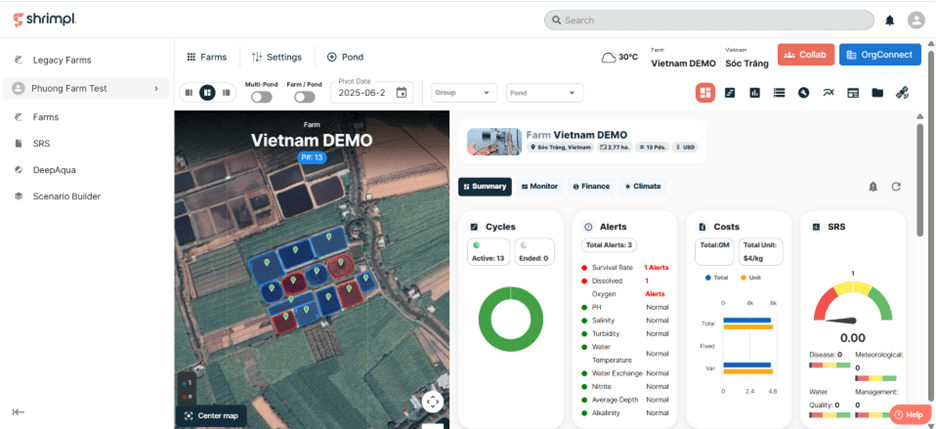
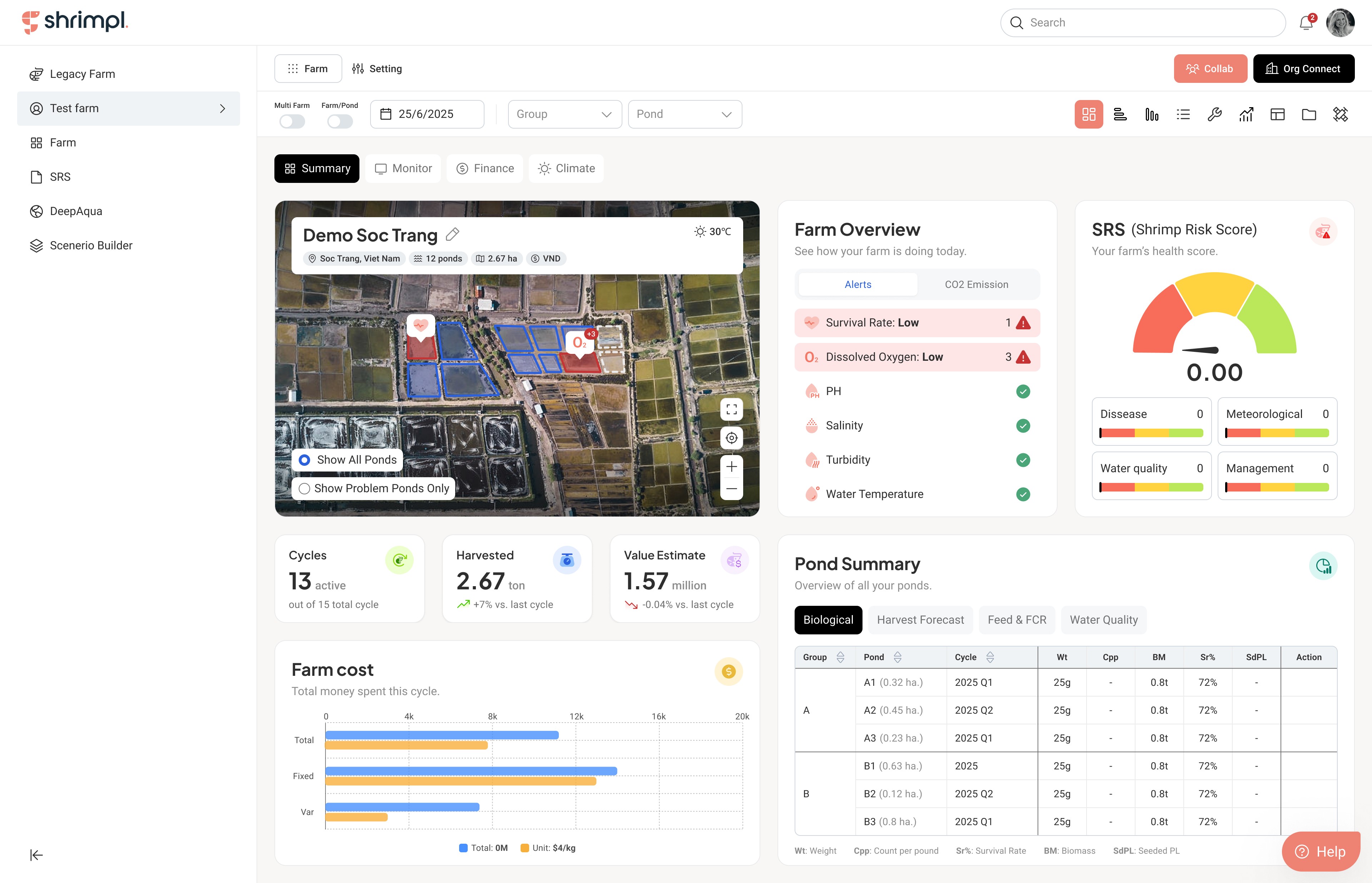
Shrimpl current dashboard
To better understand the users and business goals behind Shrimpl’s dashboard, I reviewed the provided product context and user responses. I learned that while current users include enterprise-level farm managers and technicians, the company is now expanding to support small-scale farmers with limited digital literacy. This shift introduces new challenges around accessibility, clarity, and confidence.
Starting by asking questions
Since the assignment didn’t include context about how the dashboard works, who it supports, or what business and user needs it addresses, I took the initiative to dig deeper. I prepared a focused list of questions and reached out to the recruiter by email to gather more information before moving forward with the redesign. Here's what I received:

Shrimpl business goals
After breaking down the problem, I made the following assumptions to guide my direction:
Problem
The current dashboard feels confusing and overwhelming - especially for small-scale farmers with limited tech experience. As Shrimpl expands its user base, the system needs to be more accessible and easier to use.
Goal
Design a user-friendly interface that works across cultures (from LATAM to Asia) and supports a wide range of users - from small farm owners to large-scale managers, across farms of all sizes.
User Personas
To ensure the redesign addresses real user needs, I created two personas representing Shrimpl’s core audience: one for small-scale farmers with limited digital literacy, and another for large enterprise farm owners. These personas helped me stay grounded in who I was designing for, highlighting key differences in context, behavior, goals, and pain points.
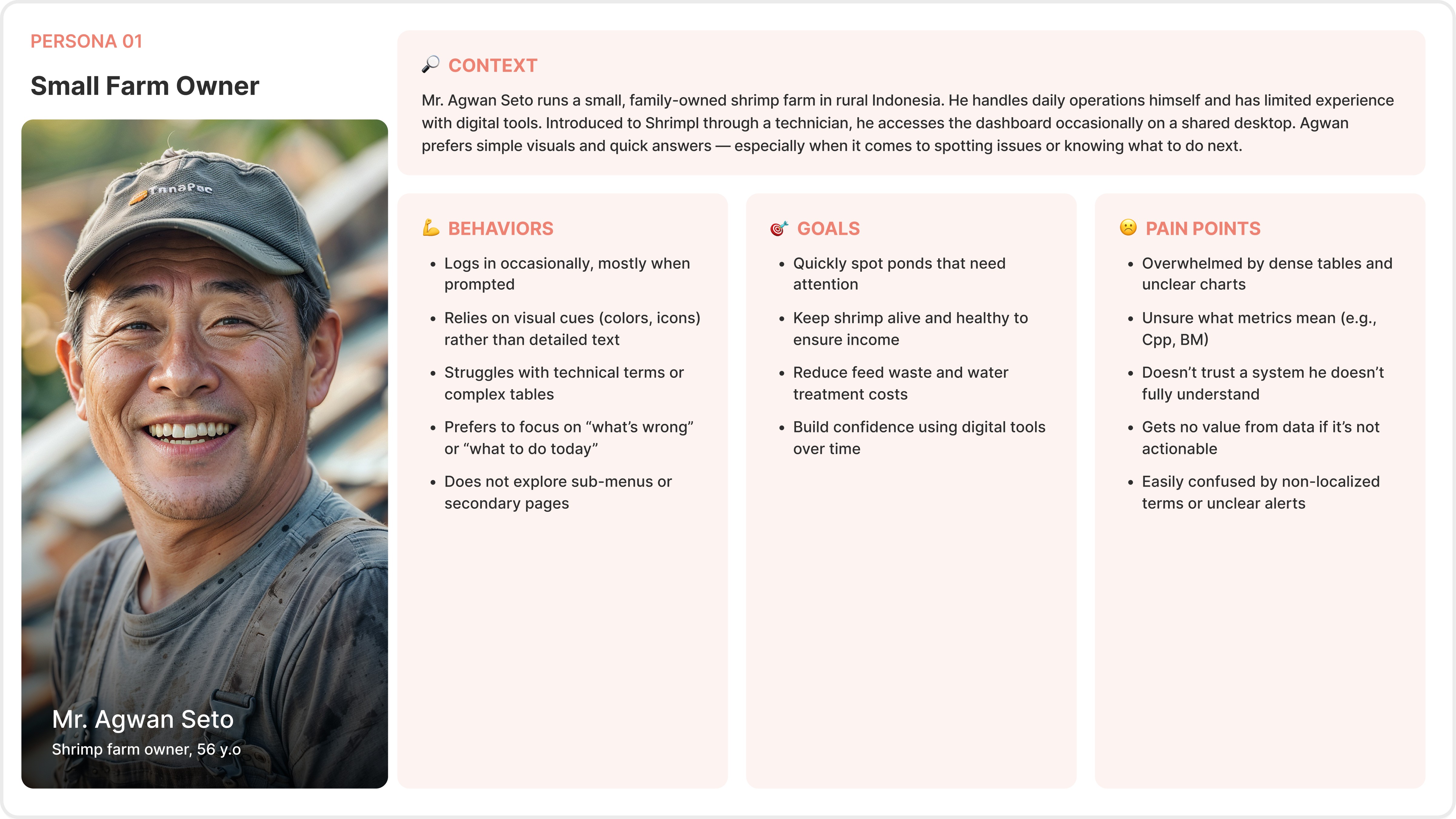
Personas 01: Small Farm Owner
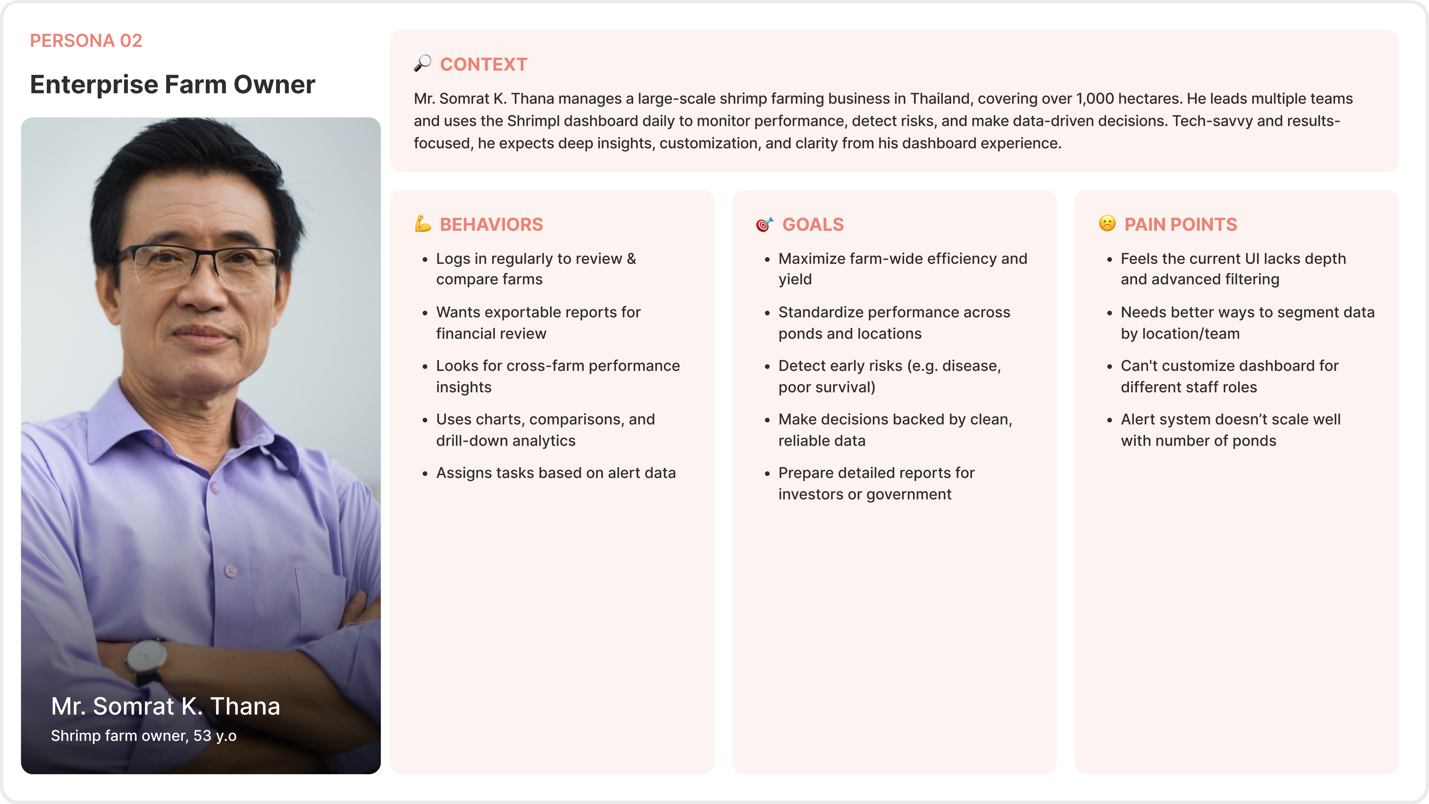
Personas 02: Enterprise Farm Owner
For this case study, I chose to focus on Mr. Agwan Seto, a small farm owner, to better align with Shrimpl’s goal of making the platform more accessible to lower-tech users.
Customer Journey Map
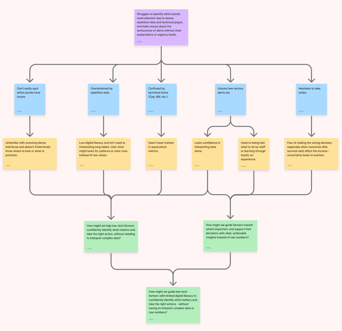
To better understand Mr. Agwan Seto’s experience with the current dashboard, I mapped out his journey across key stages - from logging in to deciding what action to take. This helped surface specific pain points rooted in his limited digital familiarity, such as difficulty spotting alerts, understanding technical terms, and knowing what steps to take next. These insights played a key role in shaping design decisions around clarity, prioritization, and guidance.
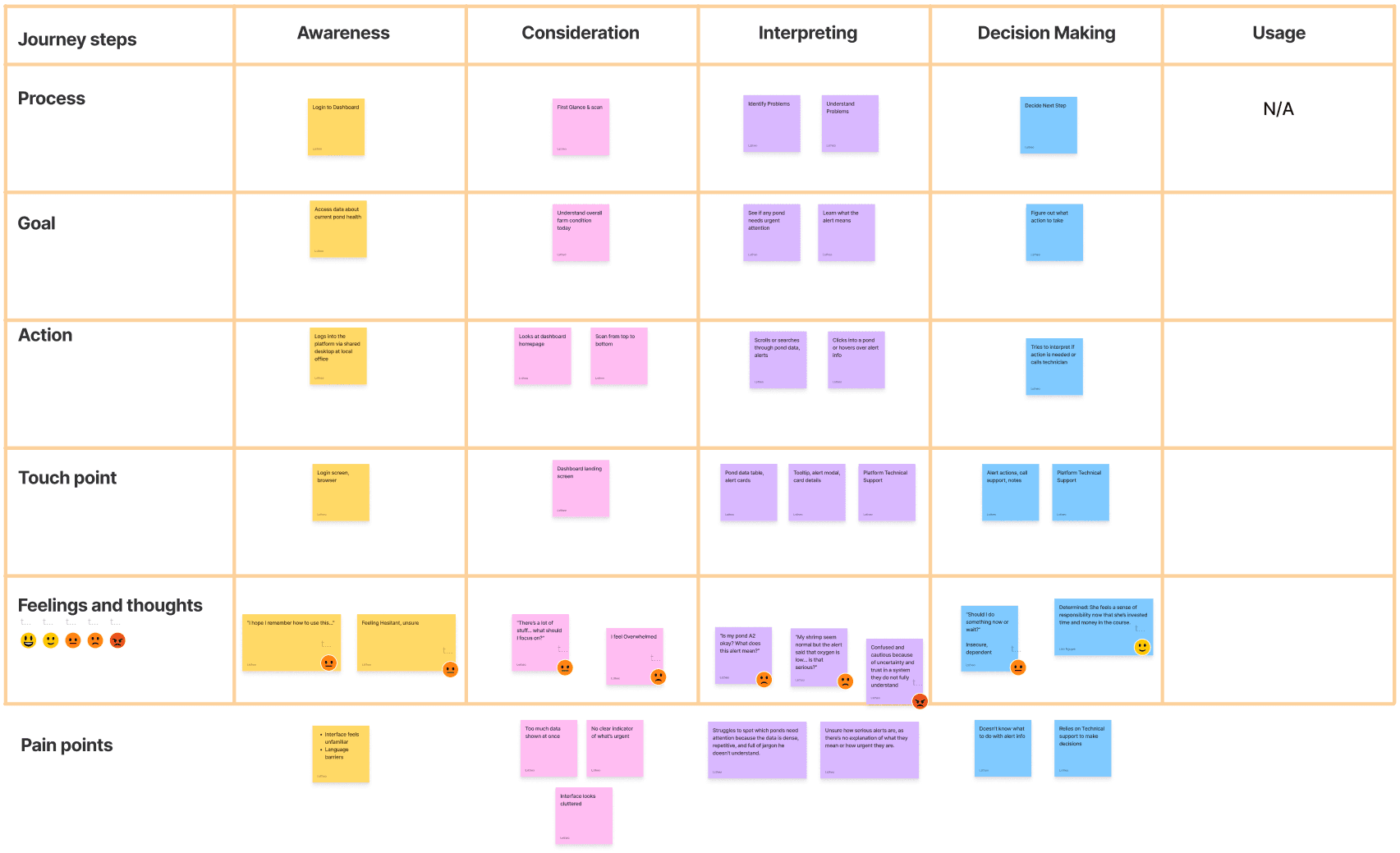
Personas 01 Customer Journey Map
After reviewing the dashboard and mapping the user journey, I noticed that Mr. Agwan’s experience often broke down at the point of identifying and responding to issues. While the dashboard displayed a lot of information, it lacked visual hierarchy and clear language - making it difficult for users like him to spot which ponds needed attention or how serious the situation was.
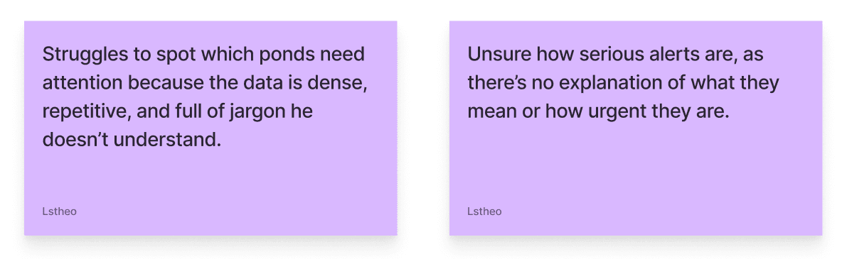
Picked out pain point
I prioritized this pain point because it directly impacts decision-making confidence. For a small farmer with limited digital literacy, the ability to quickly understand what's wrong and what to do next is critical. Resolving this issue meant not just simplifying the interface, but also improving the way urgency and context are communicated across the dashboard.
How Might We (HMW)
Based on the key pain point identified in the user journey, I reframed the design challenge into a guiding question. This helped me stay focused on delivering solutions that not only simplify the interface, but also support users like Mr. Agwan in making confident, informed decisions without needing to interpret complex data. The HMW statement became the foundation for all design directions that followed.
How Might We Board
To guide the redesign, I defined a set of principles that reflect both the user’s needs and Shrimpl’s product goals. These foundations helped shape decisions around layout, hierarchy, accessibility, and tone - ensuring the dashboard is not only functional, but also easy to understand and act on for users like Mr. Agwan.
Design Critique
Before moving into ideation, I conducted a critique of the current Shrimpl dashboard to understand what’s working and what’s not.
This helped me identify key opportunities for improvement and avoid discarding useful elements. I focused on both the visual structure and the user experience, especially from the perspective of small -scale farmers with limited digital literacy. Below is a breakdown of the pros and cons I observed.
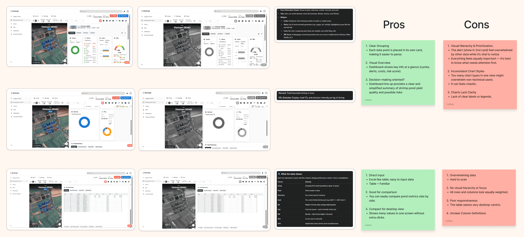
Design Critique Board
Visual Research
To gather inspiration and understand common patterns in farm and data dashboards, I explored similar products across the agriculture and aquaculture space. I analyzed how these platforms structure their information, present alerts, and balance data density with usability.
By critiquing what worked and what didn’t, I identified design opportunities that could be adapted and simplified to better serve Shrimpl’s target users - especially those with limited tech familiarity.
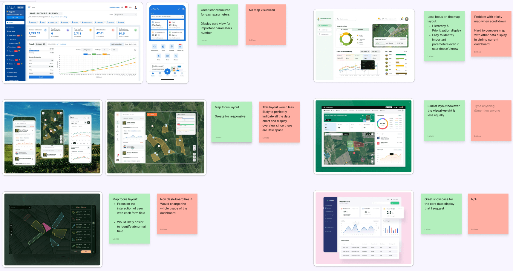
Visual Research Board
Ideation Focus
Based on the user pain points and research insights, I identified four key areas of the current dashboard that needed rethinking. Each of these areas directly impacts how clearly and confidently a small-scale farmer like Mr. Agwan can understand the dashboard and take action.
My ideation focused on simplifying interaction, improving visual hierarchy, and highlighting only what truly matters - while still keeping the system scalable. Here are the four redesign priorities I explored:

Ideation Board
Map – Prioritize Problem Ponds Only
Not all ponds need the same visual weight. Normal (blue) ponds should remain quiet and unmarked to avoid distraction. Instead, the map should only highlight ponds with issues using icons, color, or motion - just like smart game UIs.
→ Progressive visual emphasis helps users focus only on what needs attention.
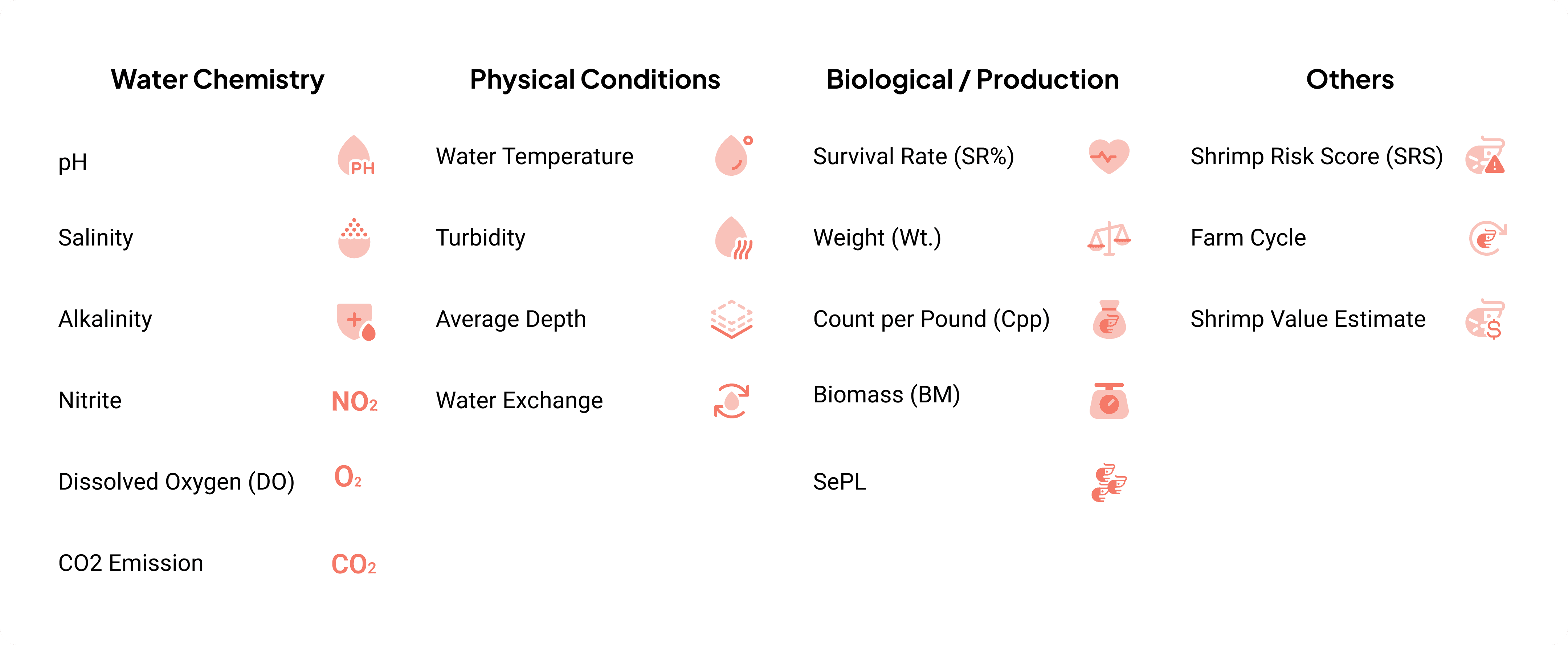
First of all, to support clarity and consistency across the redesign, I created a dedicated set of icons tailored for this case study. The icons were designed to be simple, recognizable, and readable at small sizes - especially for users with limited digital experience
Icon Set
Then help users quickly identify which ponds need attention, I explored three variations of how alerts could appear on the map. Each version is designed to support low-literacy users by combining clear iconography, color, and readable labels - without overwhelming the screen.
1. Red Background Tooltip with Alert Icon
A bold red tooltip appears above ponds with issues, showing an alert icon and the number of problems. This version draws strong visual attention to problem areas, making them hard to miss.
2. White Background with Red Alert Icon
A cleaner version with a white tooltip and a red icon for alerts. It still shows the number of issues but uses softer contrast, creating a more balanced look for dashboards with multiple ponds.
3. Direct Icon on Pond
Instead of using a tooltip, this version places the actual issue directly on the pond card/map area. It removes extra clicks and helps farmers instantly understand what’s wrong without hovering.
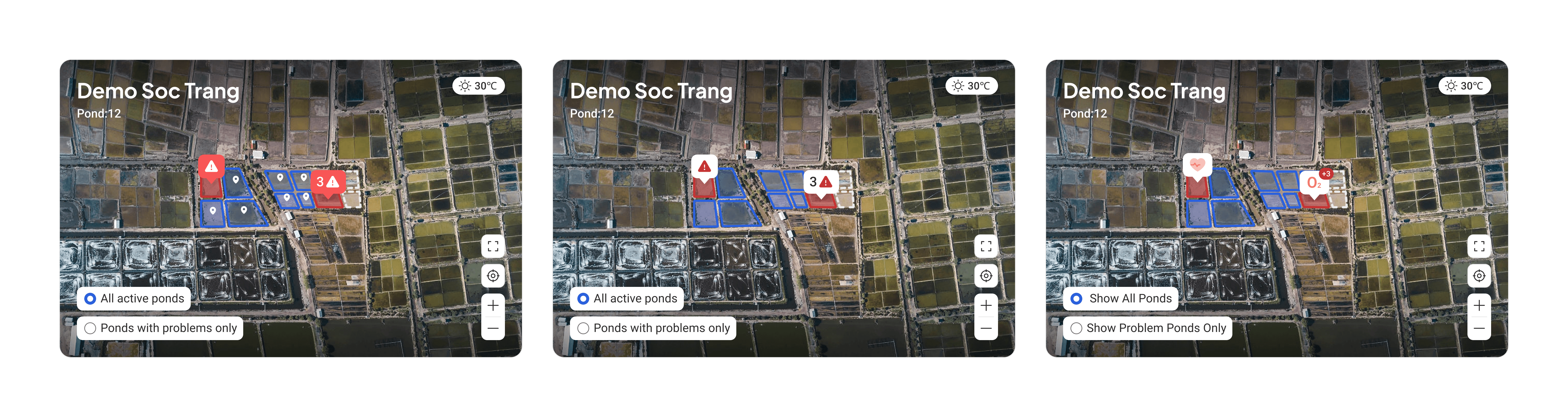
Map Redesign
Out of the three map alert variations, I chose to move forward with the third option - displaying the issue directly on the pond. This approach provides immediate context without requiring extra effort from the user. It removes the need to hover or interpret icons, and instead tells the farmer exactly what’s wrong at a glance.
To maintain clarity and avoid clutter, only the most critical issue is shown by default. When the user clicks on the pond, the map zooms in and expands to reveal a full list of alerts related to that pond - allowing users to take a deeper look only when needed.
This interaction balances simplicity and depth, and is especially helpful for low-literacy users who need direct, actionable information.

Map Redesign
Alert – Improve Visibility & Accessibility
Vital alerts are lost in the clutter and hard to notice, especially for color-blind users. Relying on color alone is risky.
→ A multi-layered alert system using icons, sorting, and grouping improves clarity and urgency.
During the redesign, I identified a key accessibility issue: in black-and-white or color-blind modes, the current alert design becomes hard to recognize. Since it relies heavily on color alone (e.g. red vs. blue), users may completely miss critical alerts - especially if they have visual impairments or are using a low-contrast screen.
To solve this, I introduced a multi-layered alert design that doesn't rely on color alone. It combines:
Universal alert icons which highlight the alert
Clear text labels with icons
This layered approach improves visibility for all users, regardless of vision ability or display settings — and ensures that critical issues always stand out when they matter most.

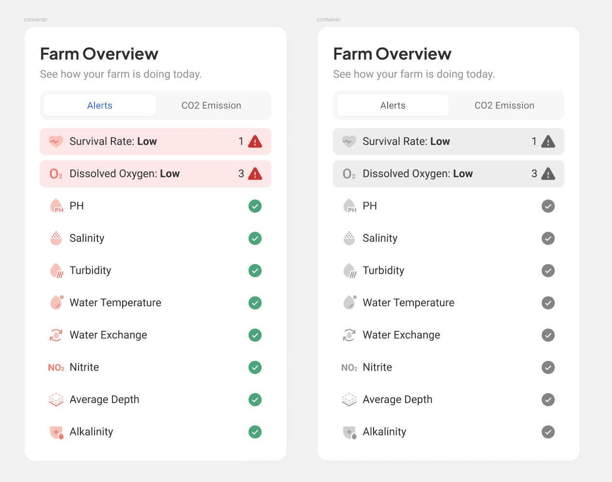
Alert section Before and After redesign
Charts – Replace with Bold, Clear Number Cards
Many charts (e.g., pie charts for cycle status or harvest data) overwhelm low-tech users. For key metrics like harvest or survival rate, bold numbers with small trend indicators are more scannable and meaningful.
→ This simplifies the dashboard, improves readability, and works better on mobile.
In my research, I found that complex charts - especially pie and donut charts - can be difficult to read for users with limited digital literacy. While charts are great for showing trends, they often require interpretation and visual familiarity. For farmers like Mr. Agwan, what matters most is getting the answer quickly: How many cycles are active? How much have I harvested?
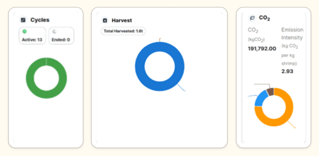
The old Charts Design
To make key metrics more scannable and accessible, I replaced certain charts with clean number-based cards. These cards highlight only the most important values, use clear labeling, and support quick comparison - reducing cognitive load and improving usability, especially on smaller screens.
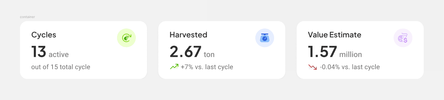
New Cards Design
Table – Reduce Data Load, Highlight What Matters
While tables are compact and good for comparison, they can overwhelm users unfamiliar with raw data.
→ By trimming down non-essential metrics and highlighting only the most important info, the table becomes a helpful guide — not a wall of numbers.
But since the purpose of the table wasn’t clearly defined in the assignment — whether it’s meant for data input or viewing only — I chose to keep the original table layout mostly intact. This allowed me to respect its possible functional role, while still suggesting improvements for clarity and accessibility where needed.
For the final redesign, I explored two layout directions to test how the content could best support usability and quick decision-making.
Layout Option 1: Fixed Map with Scrollable Overview
The first layout I explored kept a structure similar to the original dashboard, with a fixed map on the left and a scrollable panel for data and overview cards on the right.
While this layout offered familiarity and continuity, it didn’t fully support the updated design direction. With simplified visuals and reduced information density, the scrollable area made it harder for users to see the big picture without extra effort. Important insights became scattered, and scanning the overall farm status in one glance felt less intuitive.
Option 1: Fixed Map with Scrollable Overview
Layout Option 2: Bento Grid for Quick Scanning
To solve that, I introduced a second layout using a bento-style grid. In this version, the map is scaled down and integrated into a more balanced layout, where key metrics - like alerts, harvest, and cycle info - are presented in a clean, modular grid.
This allows users to take in everything at once, without scrolling or losing context. The structure feels lighter, more organized, and better suited to low-literacy users who need clarity, not complexity. It also adapts well to different content lengths and future scaling.

Option 2: Bento Grid for Quick Scanning
This case study pushed me to adapt my process under constraints. Without full product context, I had to ask the right questions, make assumptions carefully, and design with empathy for users I couldn’t directly speak to.
The biggest challenge was balancing simplicity with usefulness. It wasn’t just about removing complexity- but about surfacing what truly matters, when it matters most. It also reminded me how language, structure, and layout work together to create clarity. Small shifts in hierarchy, copy, or layout often made a big difference.
Here are three key takeaways I’m carrying forward:
Ask early, ask clearly
Good design starts with good questions.
Clarity beats cleverness
Simple, direct thinking builds user confidence.
Small changes matter
Even subtle tweaks can improve scannability and decision-making.