Design System / System Research

A flexible design system for ZIM’s products, solving color inconsistencies and creating a foundation that balances creativity with consistency across teams.
Overview
As ZIM continued to grow, our products started to look and feel inconsistent. Each team was designing and building slightly differently, which made scaling harder and user experiences less unified.
To solve this, we decided to build a shared design system - a single source of truth that could be used across all ZIM products to drive consistency, speed up development, and make collaboration smoother.
What I actually did in the project
I led the design system from start to finish: auditing existing designs, building the foundation (like color, typography, spacing), creating reusable components, and setting clear usage guidelines. I also worked closely with designers and developers to make sure the system was practical, flexible, and ready to use across multiple products.
Adapting the System, Not Rebuilding It
The biggest challenge wasn’t starting from scratch - it was adapting my new design system to fit an existing, imperfect one. Instead of rebuilding everything, I focused on evolving the current system to better support new needs while maintaining consistency. Follow along to see how I made thoughtful adjustments that worked within real-world constraints.
Business Objective
Over time, our design system became overloaded with too many colors tokens. With multiple people - including our CEO - directly involved in designing, the system grew complicated and inconsistent.
Our CEO shared that he didn't want the brand to be tied down to just a few strict colors. So, reducing the number of colors wasn’t our goal. Instead, the real issue was that each product started developing its own "mini" style - using different primary and secondary colors, or sometimes none at all. Developers often chose random colors for components, which led to a scattered and unprofessional user experience.
Accessibility Failures
Another major issue was the way colors were handled: the old system heavily relied on opacity layers to create variations. While it added flexibility, it also caused serious accessibility failures - many color combinations didn’t meet contrast standards across different backgrounds, in both light and dark modes.

Yea, these were used for text color on white (and grey) background :(
Our goal was clear: Unify the color usage across all products.
Instead of cutting down creativity, our goal was to bring alignment without limiting expression.
We aimed to create a flexible but structured color system that teams could confidently use across all products - ensuring consistency in design and development, while still allowing each product enough room to reflect its own character and meet different user needs.
Before building the system, I knew that a strong structure was essential for long-term scalability and easier team adoption. So, I focused my research and exploration on three key areas:
Defining the Token Architecture
I started by designing a clear, flexible token system — covering colors, typography, spacing, and elevation. This allowed us to build a shared language across products while still maintaining enough flexibility for future needs.

Token System Architecture
Standardizing Component Specifications
Each component was broken down with detailed specs: behavior, states, responsiveness, and variations. This ensured that designers and developers were aligned early, reducing inconsistencies later on.

Components specs
Mapping the Flow from Design to Development
Finally, I outlined a practical workflow that connects everything from token usage, to component design, to developer handoff. This flow was designed to be easy to adopt, helping the team move from idea to production-ready with less friction.
By grounding the system with clear research and structure, we were able to create a design system that was not only consistent across products but also practical for everyone to use - from designers, to developers, to leadership.

From Design to Development
Creating a reliable design system started with setting strong foundations - from the smallest details like spacing units to full component structures. Here’s how I approached it:
Token Layers
I built a base token system to manage basic design decisions like color, spacing, typography, and elevation. Tokens allowed us to ensure consistency across all products and make future updates faster and easier.

Base color token
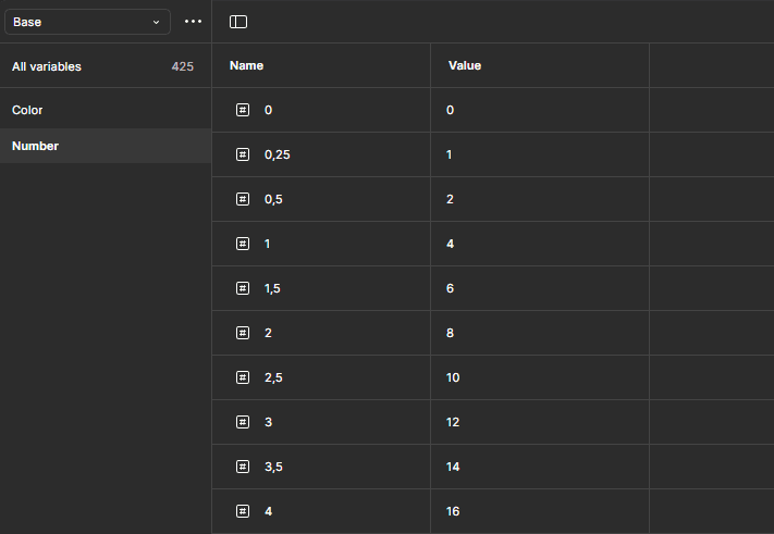
Base number token
4px-grid System
To keep layouts clean and aligned, I introduced a 4px-based grid system. This grid standard helped us maintain structure across different screen sizes and made component scaling smoother.
Building Design Tokens
I mapped out color tokens (primary, secondary, neutrals, feedback colors) and number tokens (spacing, radius, border width, elevation) to create a flexible, scalable foundation for both light and dark themes.

Color Tokens

Number tokens
Color Accessibility Test
To ensure strong accessibility across our system, I first defined the purpose of each color -separating them clearly into text colors (like primary, secondary) and background colors (like surface, subtle, on-subtle, muted).

Color range
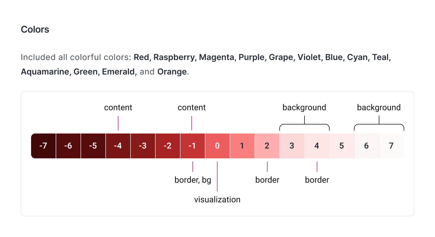
Color defined
Then, I tested every text color against every background color combination. If any pair failed the accessibility standards (mainly WCAG contrast ratios), I adjusted the text color until all combinations passed - for both light mode and dark mode.
This careful process made sure that no matter how the components are used, accessibility stays intact. Each color token was assigned to a specific usage scope, minimizing risks of misuse and keeping the system both flexible and inclusive for all users.

Color Accessibility Test
Typography
I defined a typographic scale that supported readability and hierarchy across our platform - covering everything from display to headings, body text and captions.

Typography
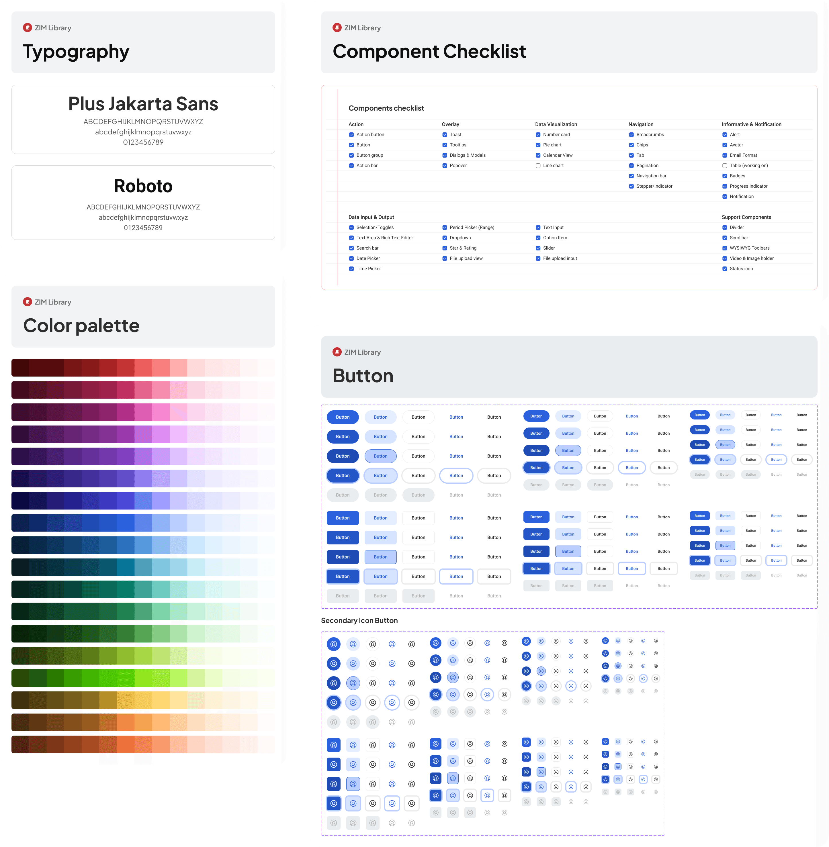
Building components
I built the core components of the design system using atomic design principles—beginning with foundational elements like buttons and inputs, then combining them into more complex structures such as navigation bars and modals. Below is a breakdown of the components included in the system:

Component checklist

Sample Components
Documentation
Each component was documented clearly with:
Overview (what it’s for and where to use it)
Properties (components properties)
Anatomy (breakdown of parts)
Types (variations like primary/secondary)
States (default, hover, active, disabled)
Status (default, open)
Sizes (small, medium, large, etc.)
Etc.
This made it easier for the team to implement correctly without endless back-and-forth.

Components documentation
Version control & Design Changelog
Since our products were already live, new components had to coexist with older versions for a time. I introduced a simple versioning strategy, so we could update gradually without breaking the current experiences, allowing smooth transitions across all teams.

Color Changelog
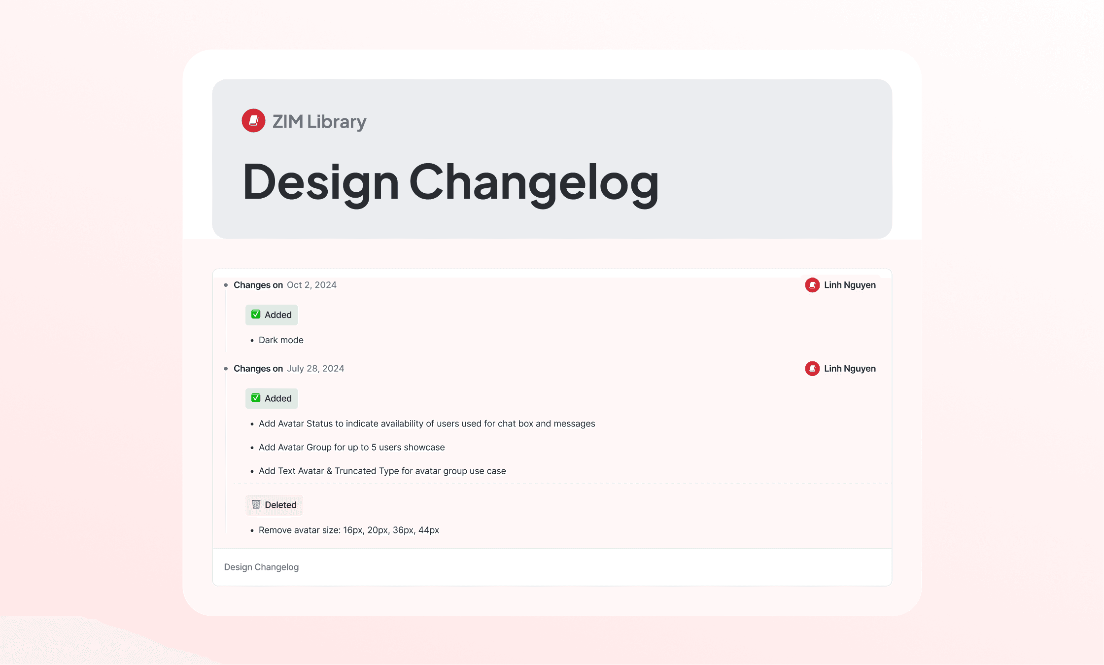
Components Changelog
In general, I've built over… 220 components by hands
The final design system includes 220+ components thoughtfully crafted for web, tablet, and mobile platforms. Each component is built with scalability in mind - easy to maintain, adapt, and expand as the product grows. I followed a modular structure, ensuring flexibility for different product needs while keeping everything consistent.

System Components
Light & Dark Mode Support
All components are designed to work in both light and dark modes. I created paired tokens for each mode to ensure smooth visual transitions and proper contrast, making the interface comfortable for users in any lighting environment.
Both light mode & dark mode supported (Chudu Speak)
One-Click Responsiveness
Each component is fully responsive and optimized for different screen sizes. With just a switch in layout settings, components adapt seamlessly from desktop to mobile—helping teams design and prototype faster with confidence.
New Home Page - Tablet
New Home Page - Mobile
With the launch of the new design system, our design process at ZIM has seen a major boost in efficiency. Designers now work 3 - 5 times faster, thanks to a shared library of consistent, ready-to-use components. Instead of repeatedly building isolated or one-off elements, we can now focus our time where it matters most - researching user needs, refining flows, and enhancing the overall UX.
This shift also sets the foundation for better collaboration with developers. We're gradually syncing design components with dev-ready versions, helping improve production quality and consistency across platforms. While we still have work ahead in fully aligning the codebase, the system has already empowered our team to deliver faster, cleaner, and more unified experiences.