Case study / Website Design / UI & UX

A flexible design system for ZIM’s products, solving color inconsistencies and creating a foundation that balances creativity with consistency across teams.
Overview
The project aimed to design a landing page for ZIM's SAT course, targeting high school students preparing to study abroad. The goal was to create an engaging, informative, and user-friendly page that effectively communicated the course offerings while addressing students' needs and concerns.
What I actually did in the project
I played a key role in creating the landing page, working closely with the design team to make sure it was clear, engaging, and aligned with our goal of supporting students throughout their learning journey.
Business Objective
To support ZIM's goal of expanding its academic offerings and improving user conversion, we launched a dedicated landing page for the SAT course series - following the proven format used for IELTS, TOEIC, and Communication courses. This initiative aims to clearly communicate the structure and value of ZIM’s SAT program, which is divided into four progressive levels: Foundation, Intermediate, Advanced, and Master.
By highlighting key course components - such as Math, Evidence-Based Reading and Writing, Essay skills, test-taking strategies, and mock exams - the landing page is designed to help prospective students and parents easily understand the learning path, build trust, and take action.
Key Metrics Analyzed
For the SAT landing page, we identified four key performance metrics to track:
Page Views - Number of visitors to the page
Time on Page - How long users stay engaged
Bounce Rate - How many leave without interaction
Conversion Rate - The percentage of users who take action (e.g., sign up or request consultation)
Among these, Conversion Rate is our most important metric - because it's the clearest signal that users understand the offer and are motivated to act.
To improve conversion, we focused on six core factors that directly impact user decision-making, inspired by insights from Cronuts Digital:
Value Proposition - Is the offer truly valuable and unique?
Relevance - Does the content match the user’s needs and expectations?
Clarity - Is the messaging and structure easy to understand?
Distraction - Are there unnecessary elements pulling focus away?
Anxiety - Are there doubts or concerns that could stop a user?
Urgency - Is there a reason to take action now?
By designing around these principles, we aim to build not just an informative page - but a high-converting one that drives real business results.
Breaking down the big problem
After pinpointing the key factors influencing our core metrics, I delved deeper into each one - exploring what drives them, how they interact, and their relevance to our target audience.

Breaking down the key metrics to analyse
User Research & User Persona
I created proto-personas to represent our two primary target groups, helping to clarify their goals, behaviors, and needs as we shape our solution.
Persona 01 - High schoolers pursuing US education

Persona 02 - Parents of high schoolers planning to study in the US

User Journey
After defining the two primary target groups, I chose to focus on Persona 1 - High schoolers pursuing US education. I then developed a detailed customer journey map to uncover their pain points, grounded in their behaviors and decision-making patterns.
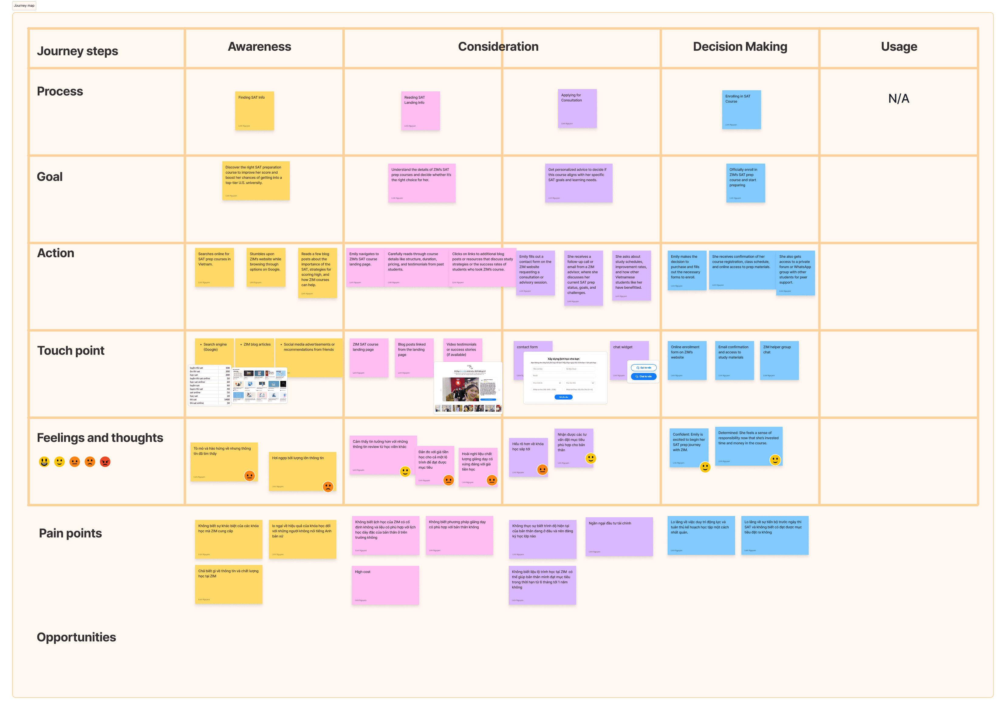
Persona 1 - Customer Journey Map
Explore solutions that address user challenges - 'How Might We'
I identified a key pain point that I could directly address:
“I’m not sure if ZIM’s class schedule is fixed, and whether it fits with my already packed school timetable.”
To better understand this concern, I broke it down into contributing factors:
Difficulty balancing schoolwork, SAT prep, and extracurriculars
Last-minute study habits
Slower learning pace than expected
Pressure to achieve high scores and keep up with peers
Uncertainty about current English proficiency and appropriate class level
Lack of clarity on whether ZIM's study roadmap aligns with personal goals within a 6–12 month timeline
Generating ideas with Crazy 8s Ideation
To explore a range of potential solutions for the core challenge, I applied the Crazy 8s method to rapidly ideate and push creative boundaries. I began by framing three key questions:
How can we help students recognize the importance of SAT preparation?
How can we accurately assess their current proficiency and target goals?
How can we guide them in building a study path and schedule that fits their lifestyle?
After a collaborative session with my design partner, we evaluated the feasibility and impact of each idea. We then synthesized our insights into a set of promising directions:
Present relatable fun facts to build awareness and motivation
Develop a 1-month self-assessment framework to help users identify their learning path
Offer pre-built learning paths based on different starting levels
Allow users to customize schedules aligned with their availability
Integrate an auto-calculation tool to estimate the required study time
And more...
This approach helped us generate focused, practical ideas while keeping user needs at the core.

Crazy 8's Ideation board
Geometry with Personality
While researching the course content - exploring various tests and assignments - I came across mathematical formulas that unexpectedly sparked inspiration. It led me to a simple yet compelling idea: what if I brought basic geometric shapes to life? By giving each form its own personality, they could visually narrate the story of the product in a way that’s both playful and purpose-driven.
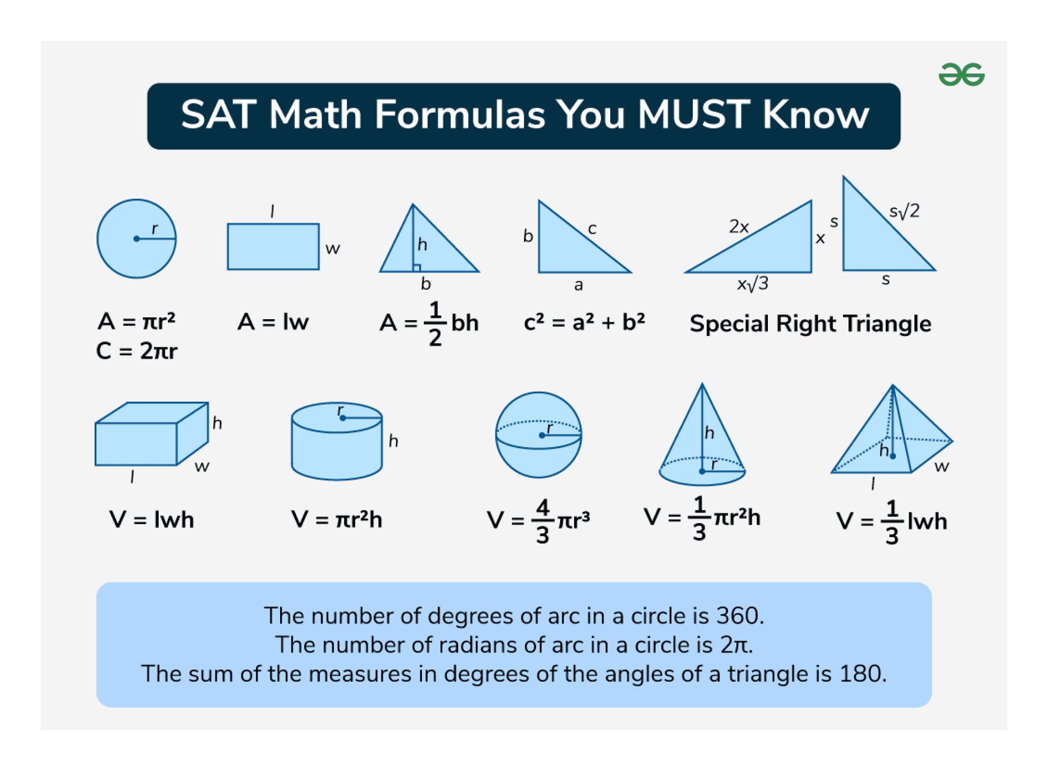
The SAT Math Formulas
Core Design Language: Shapes That Tell a Story
The core concept behind this landing page design was inspired by personified geometric shapes - playful, colorful, and full of characteristic. Given the product's strong ties to math and geometry, this visual direction felt both fitting and meaningful.
To bring this idea to life, I selected four fundamental geometric shapes and transformed them into expressive illustrations, each symbolizing a unique message or function within the design.

The core design elements
These are some of the inspiration pieces I designed—using colorful geometric forms to craft a cohesive and engaging visual narrative for the product.
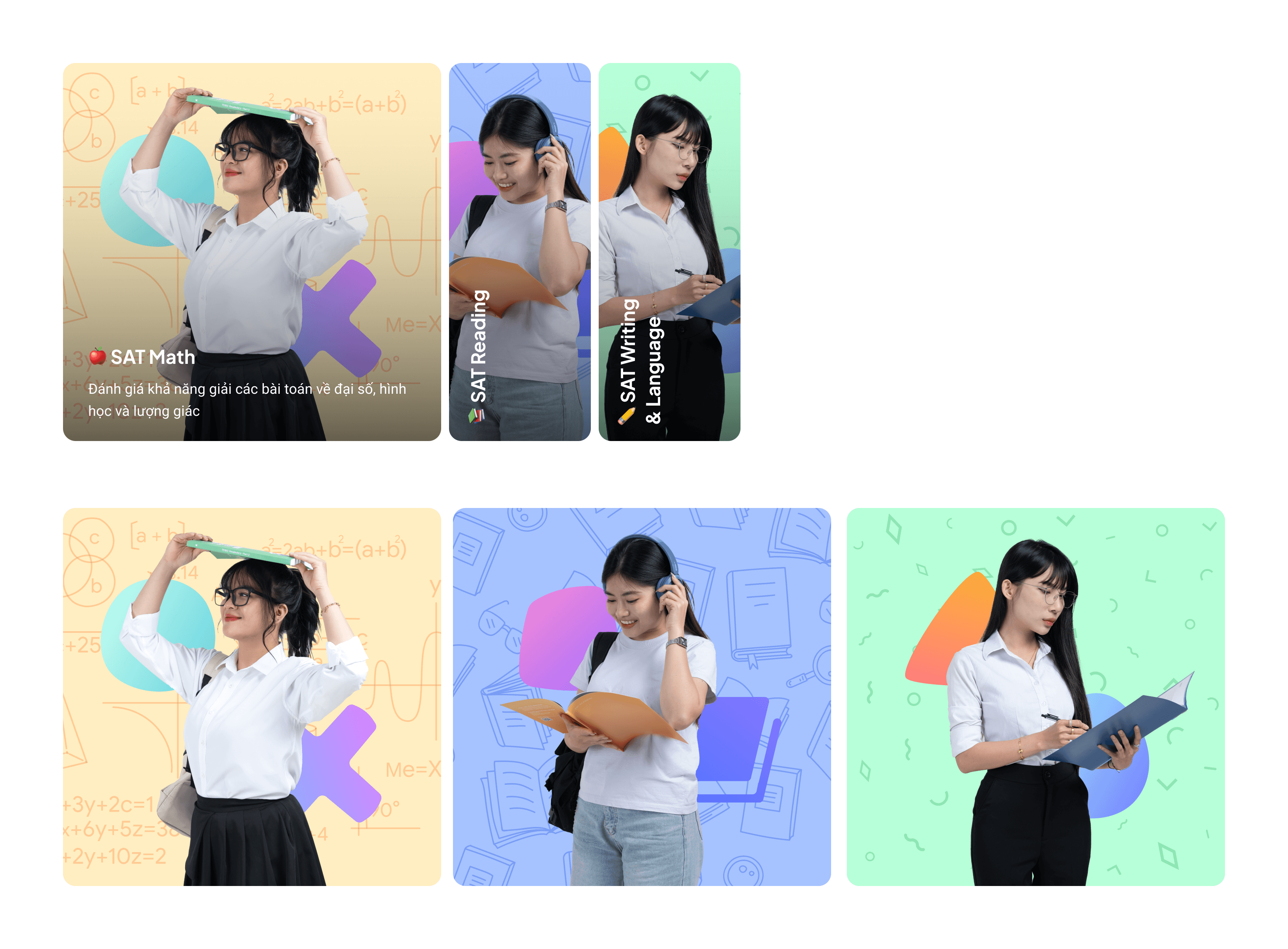
Hero banner images
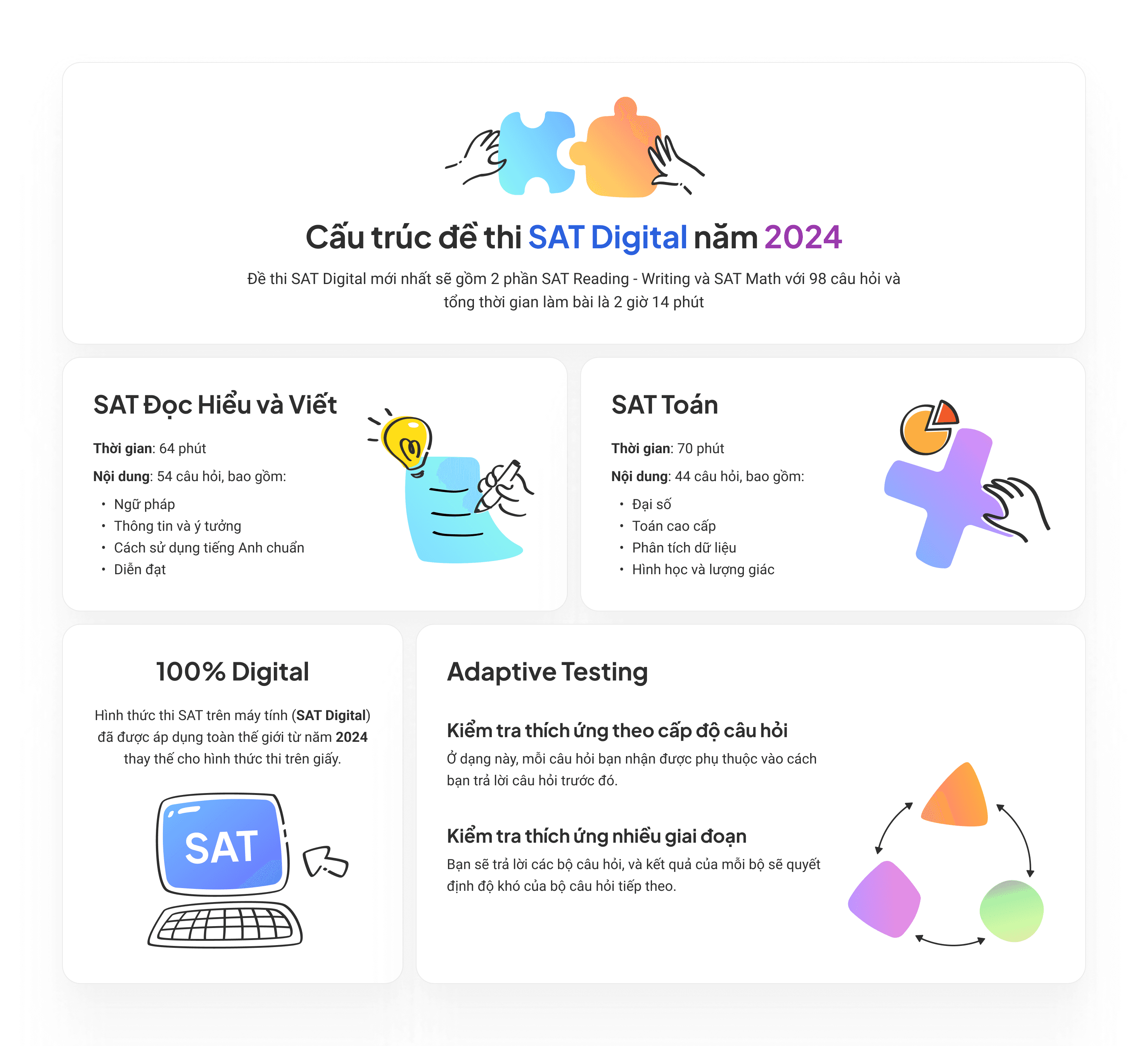
Exam structure
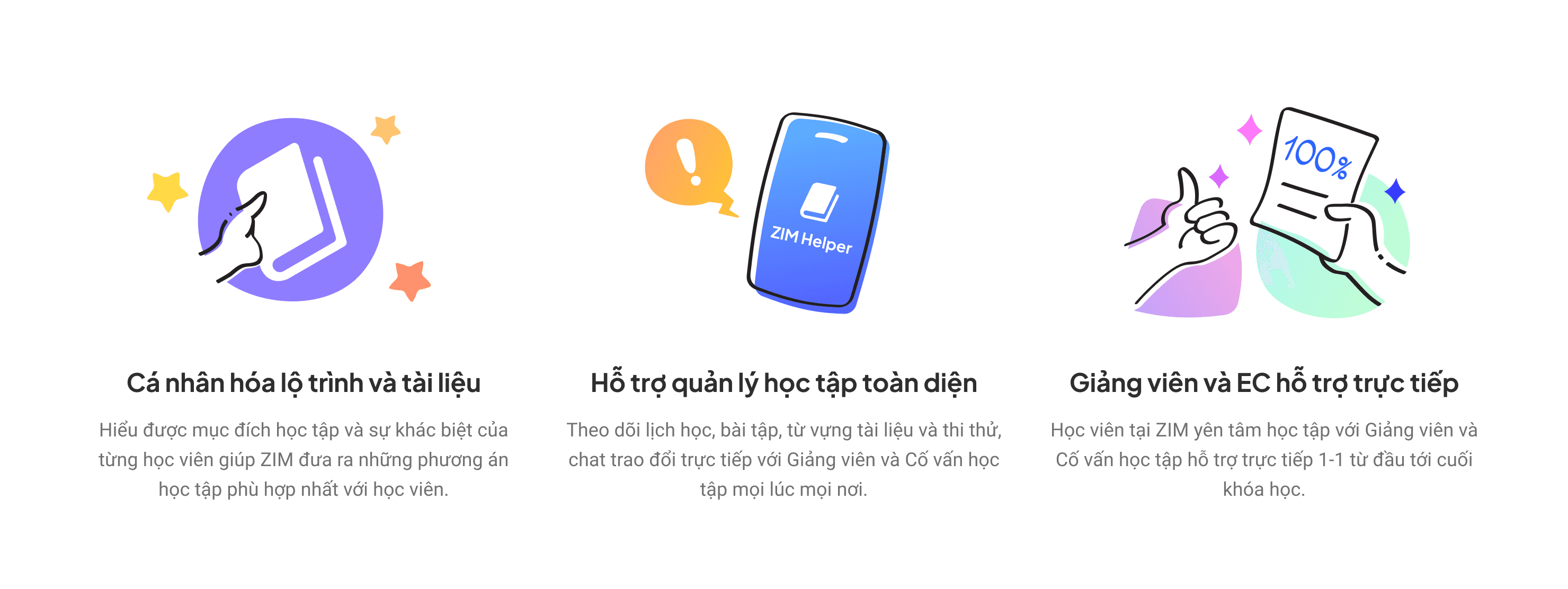
ZIM Benefits
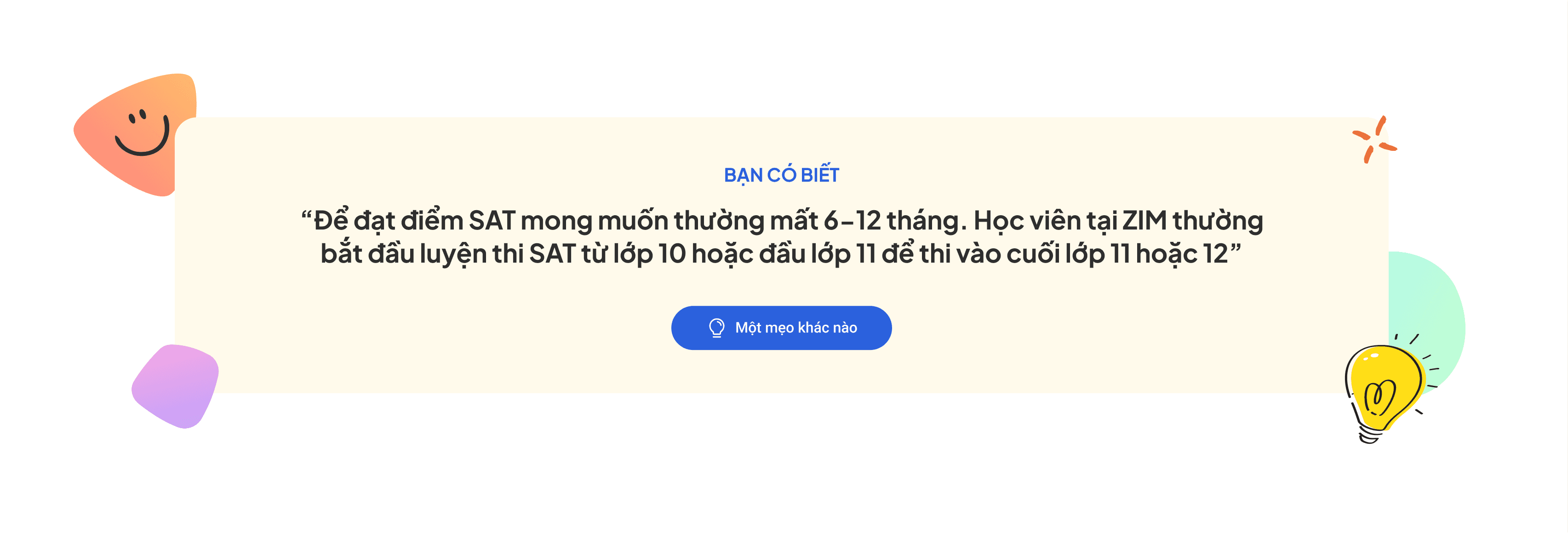
Fun facts about SAT
From Insight to Interface
After rounds of research, ideation, and iteration, I translated all insights into a design that balances both function and personality. The final landing page integrates colorful geometric forms inspired by mathematical concepts, brought to life with a playful and engaging tone that resonates with high school students preparing for the SAT. Each visual element reflects the academic nature of the course while carrying its own unique character, helping shape a cohesive product story.
The design is structured to guide users through their learning journey, address their key concerns, and support decision-making with smart, user-centered features - such as personalized study paths, flexible schedules, and clear value communication. Here’s how everything came together.
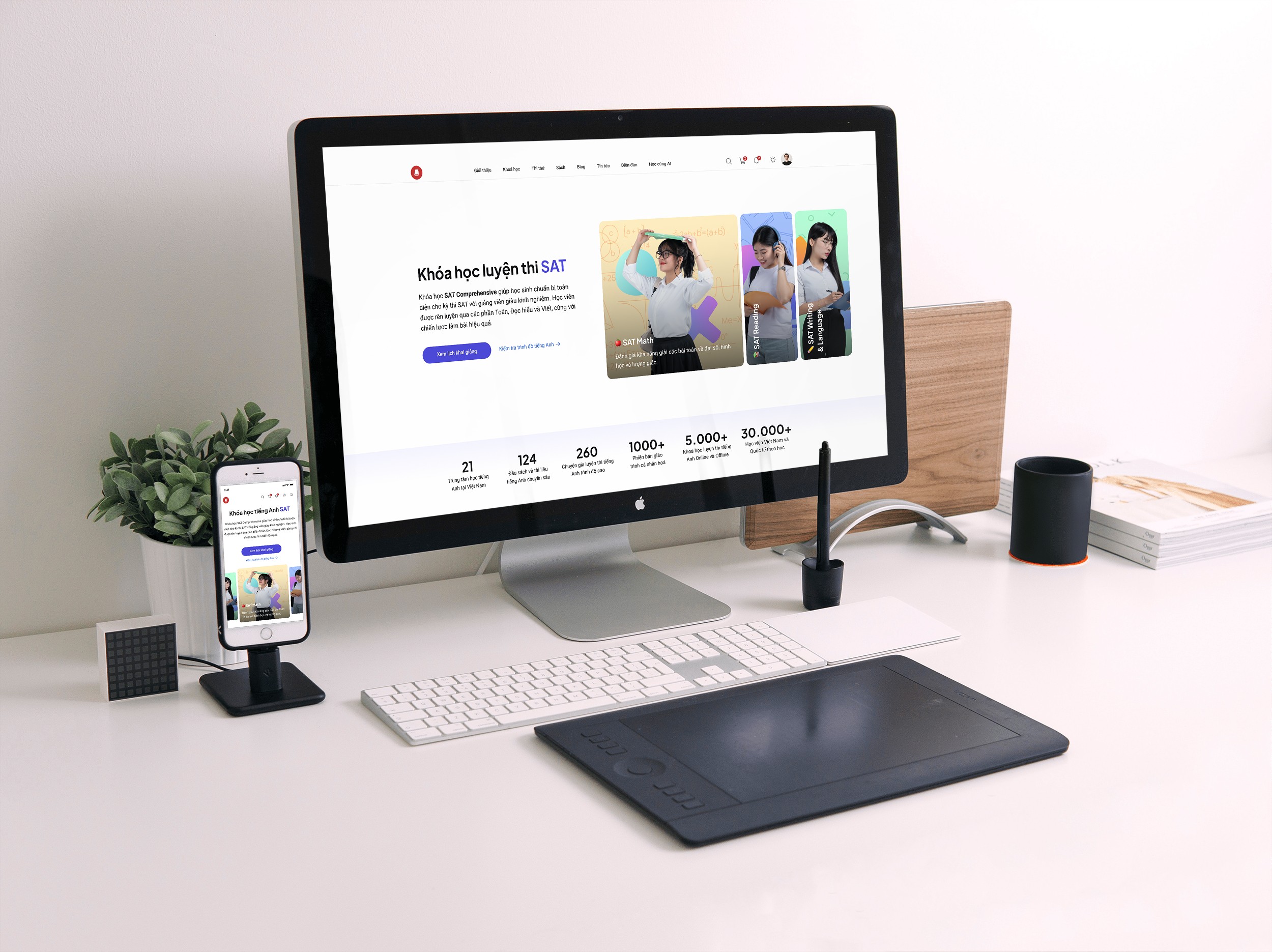
SAT Landing Page

SAT Landing Page
Here's what I learned
This project was a great balance of creativity and problem-solving. Starting with user research, I focused on the real struggles of students and parents preparing for the SAT. By narrowing the target group, I was able to design a more relevant and helpful experience.
Through each iteration, I explored playful, geometric visuals inspired by math - making the content more engaging while staying aligned with the course theme. Every design choice aimed to simplify the journey, build trust, and support key decisions. This process reminded me how valuable it is to stay user-focused while still pushing for creative expression.